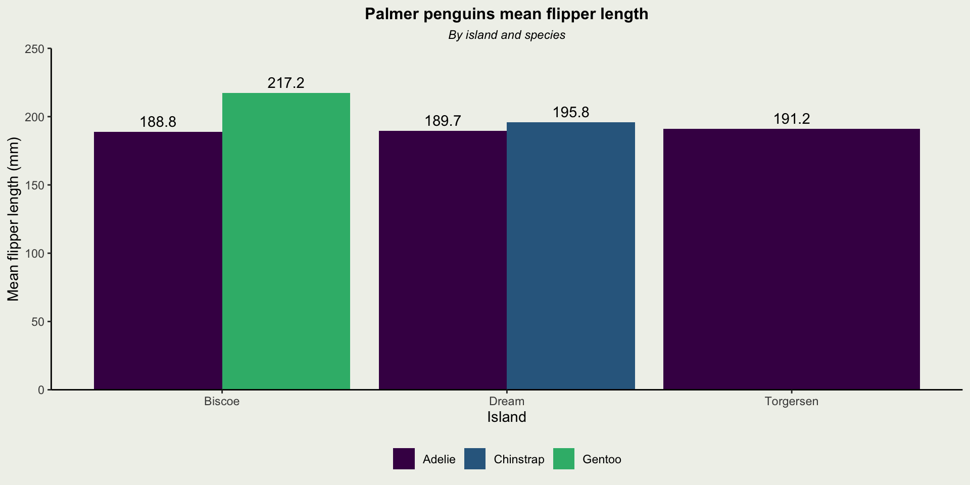
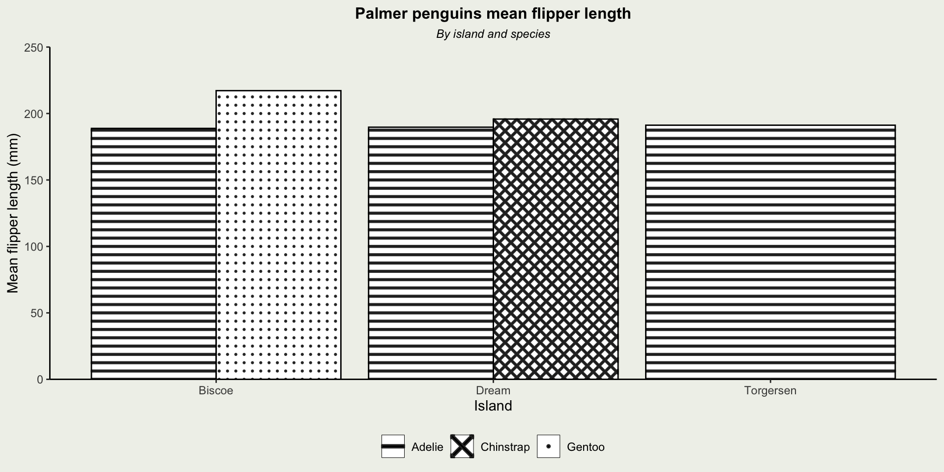
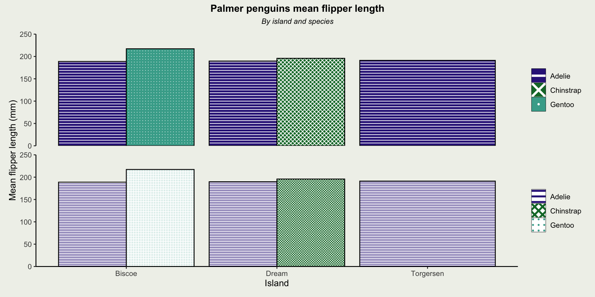
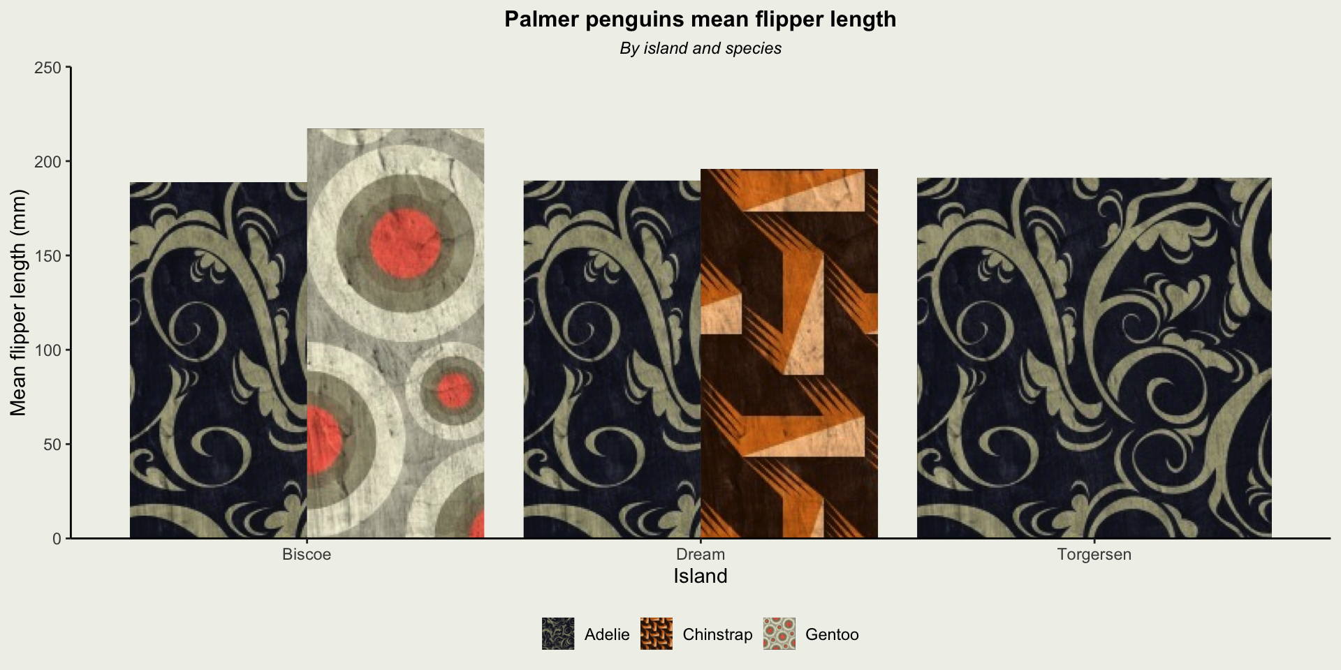
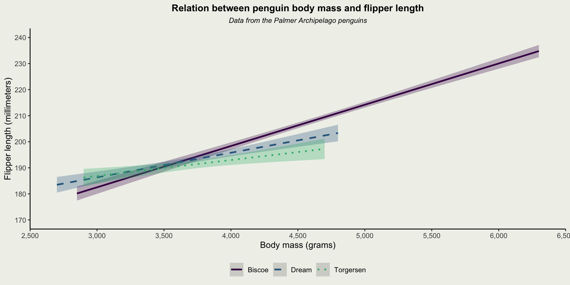
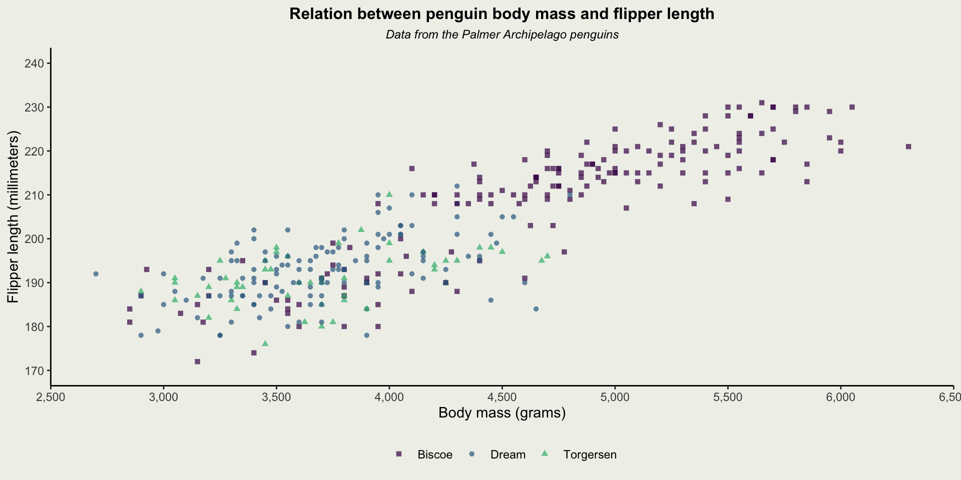
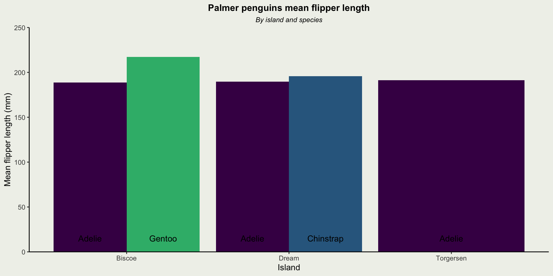
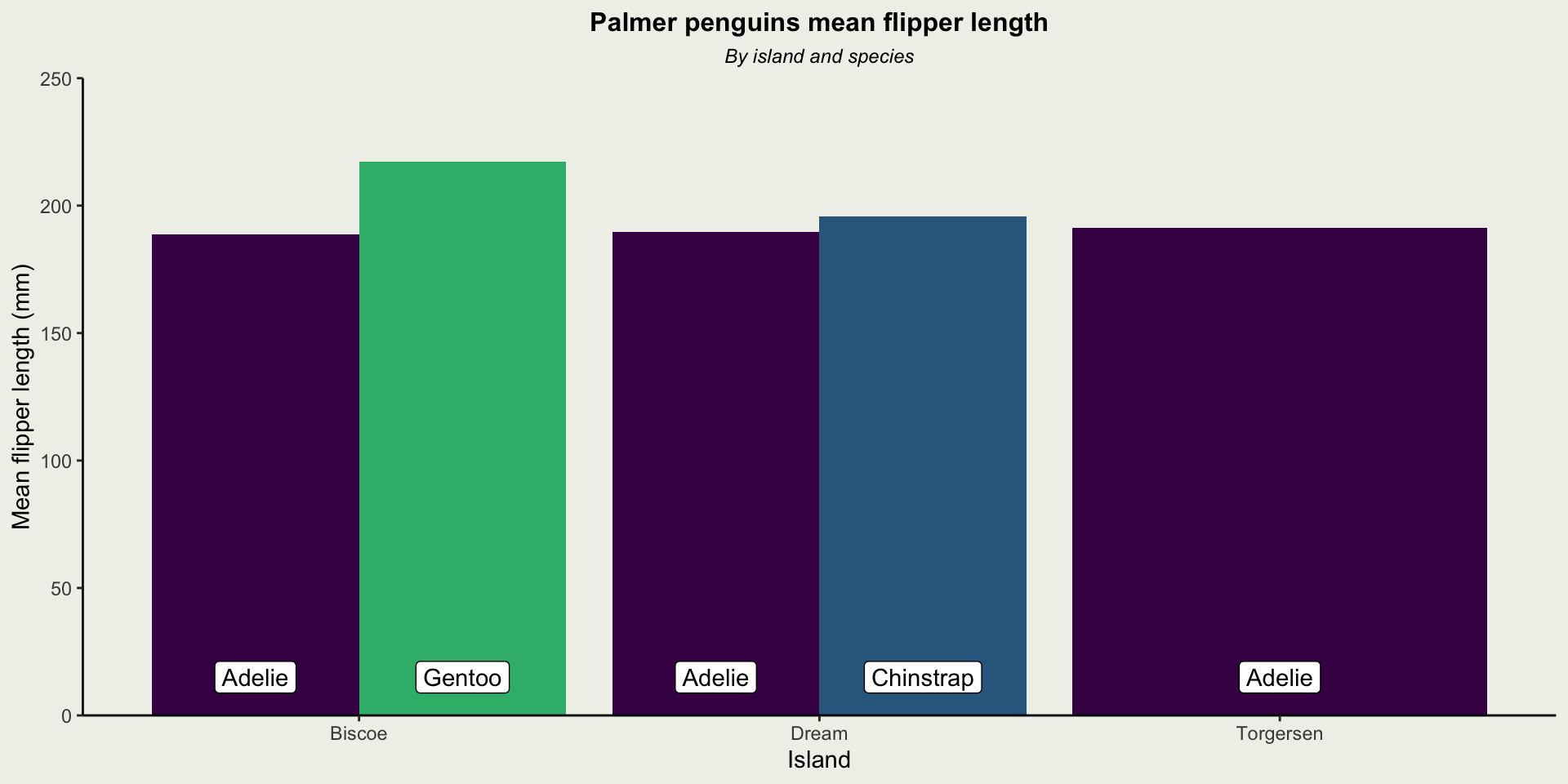
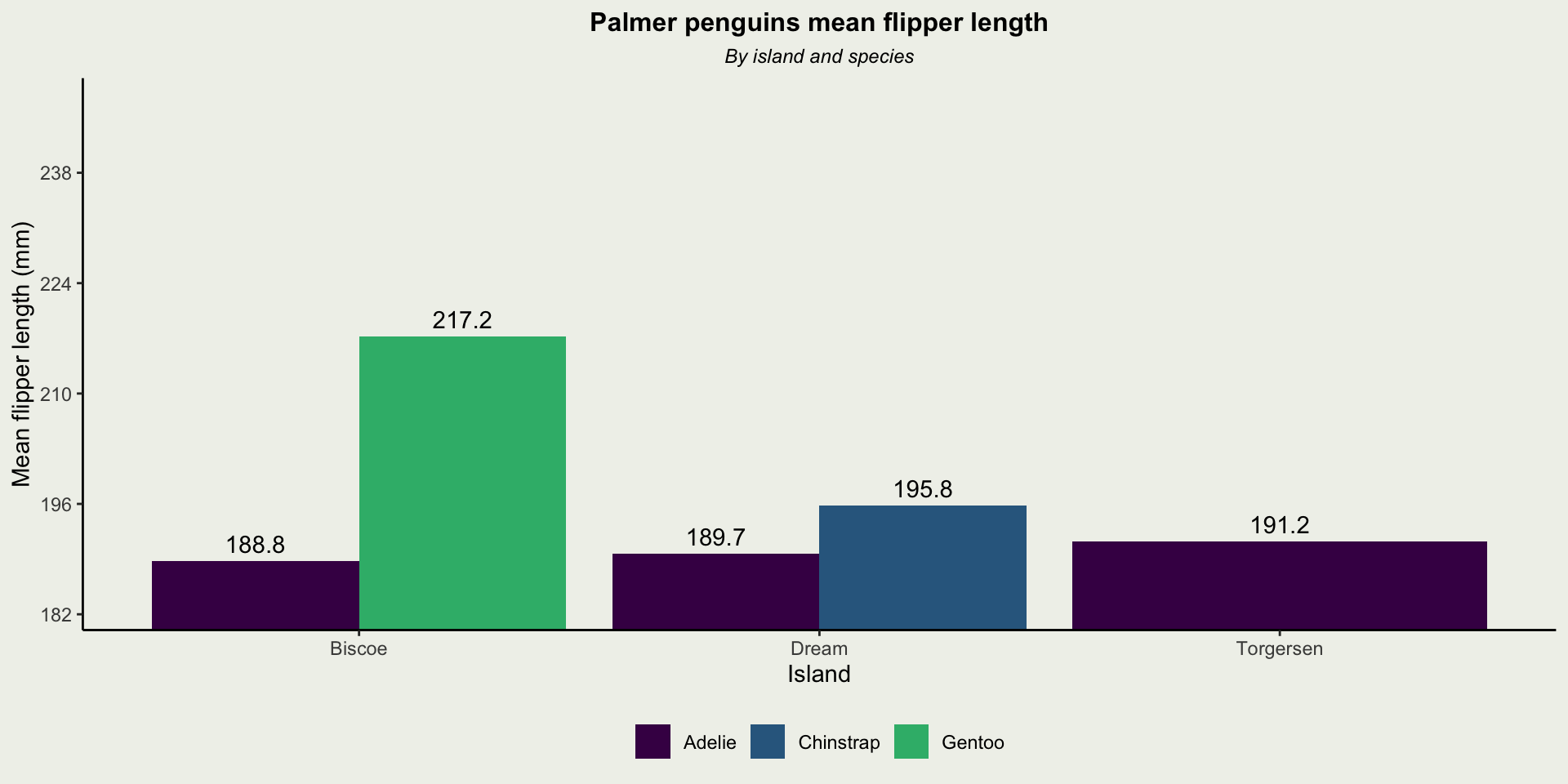
| Island | Species | Mean flipper length (mm) |
|---|---|---|
| Biscoe | Adelie | 188.8 |
| Biscoe | Gentoo | 217.2 |
| Dream | Adelie | 189.7 |
| Dream | Chinstrap | 195.8 |
| Torgersen | Adelie | 191.2 |
Figuring It Out
Figures are Fundamental
Allow us to swiftly convey a message
Easier to compare than numbers
Can capture your audience
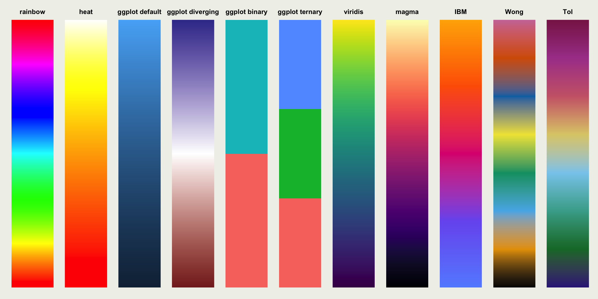
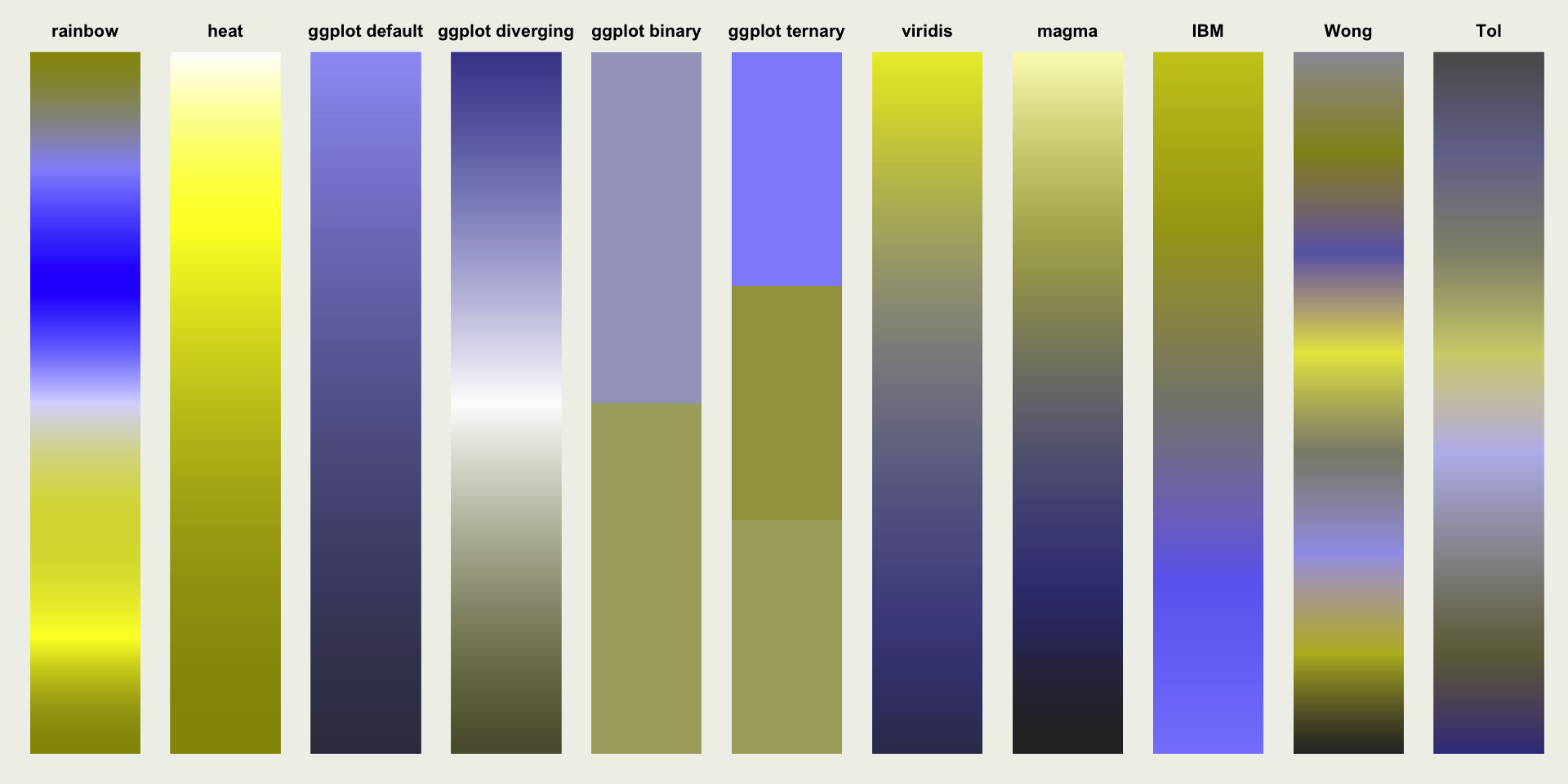
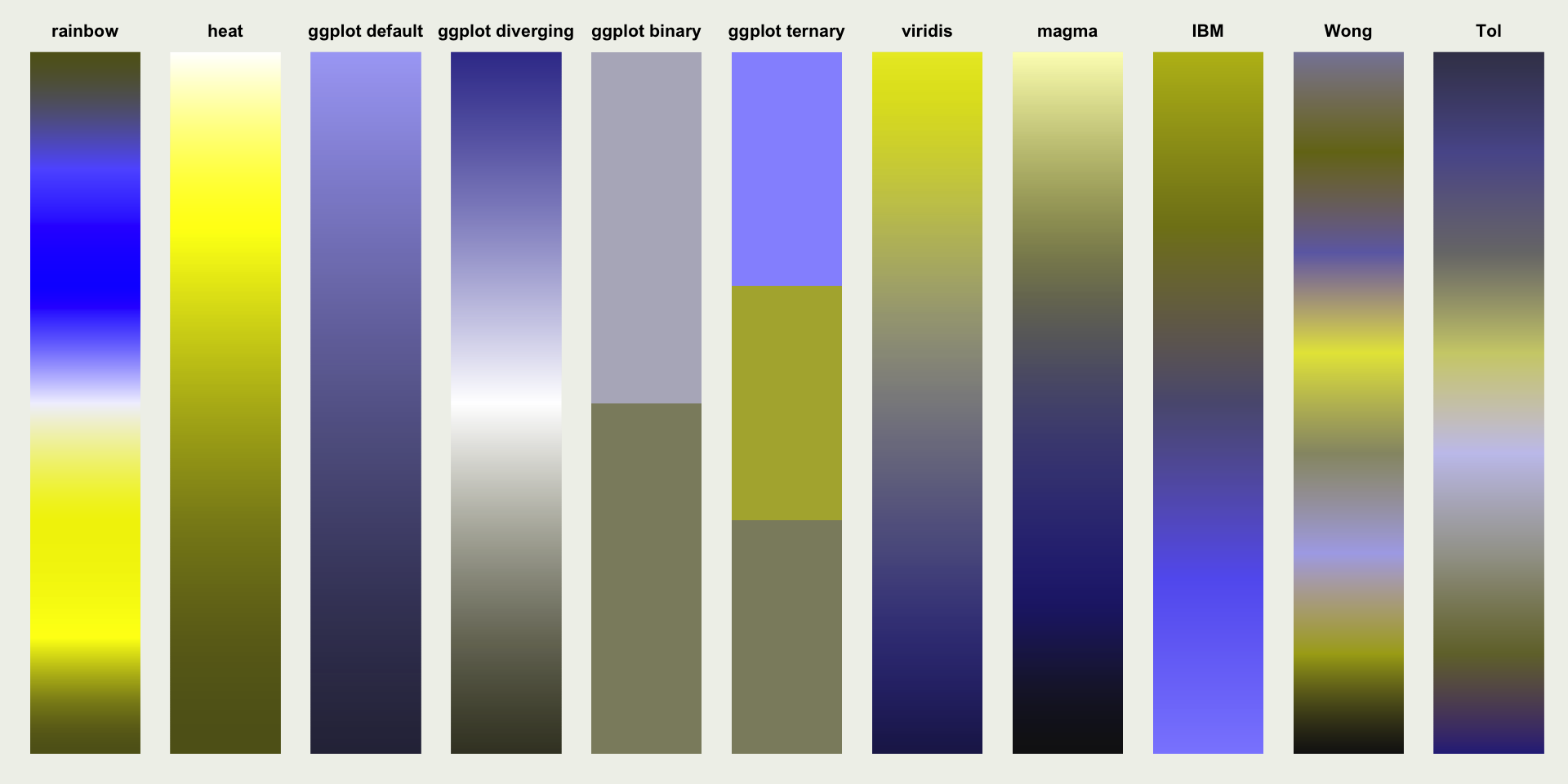
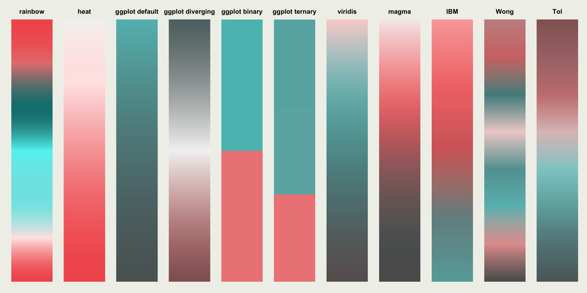
Colouring for Colourblindness
Let’s compare some different colour scales:
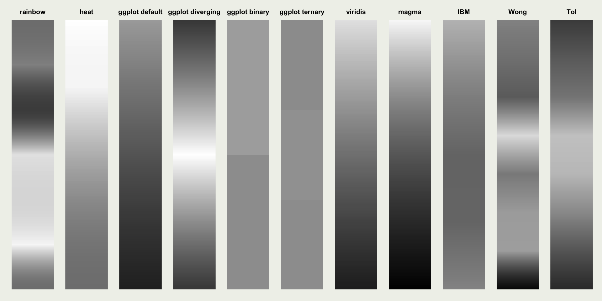
Colouring for Colourblindness
Green-blind (deuteranopia):
Colouring for Colourblindness
Red-blind (protanopia):
Colouring for Colourblindness
Blue-blind (tritanopia):
Colouring for Colourblindness
Monochromacy (achromatopsia):
Substituting for Shapes
Shapes with areas can use patterns:
Substituting for Shapes
We can still use colours with patterns:
Substituting for shapes
Or just go crazy…
Substituting for Shapes
Lines can use linetypes:
Substituting for Shapes
One-dimensional objects can shapeshift:
Contrasting Colours
Contrasting Colours

Contrasting Colours
3D < 2D
3D barcharts? Don’t.
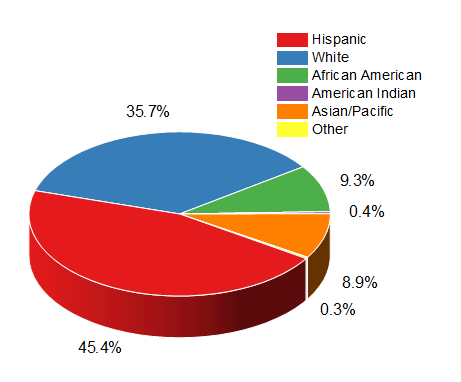
3D piecharts? Don’t.
3D scatterplots? Perhaps…
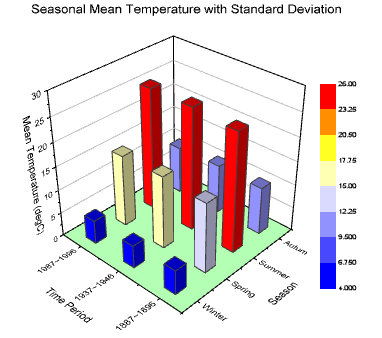
3D scatterplots
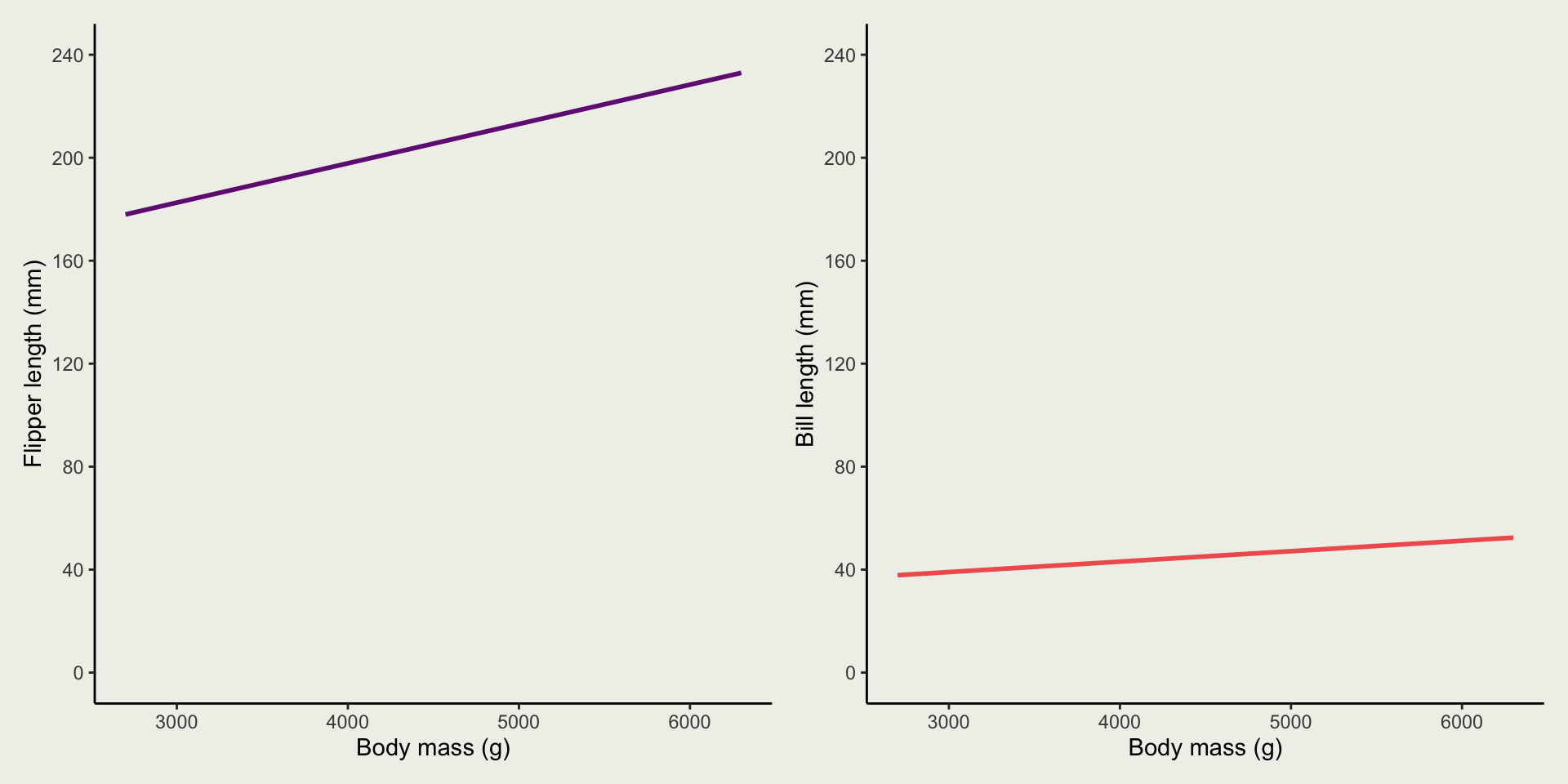
Dual Axes
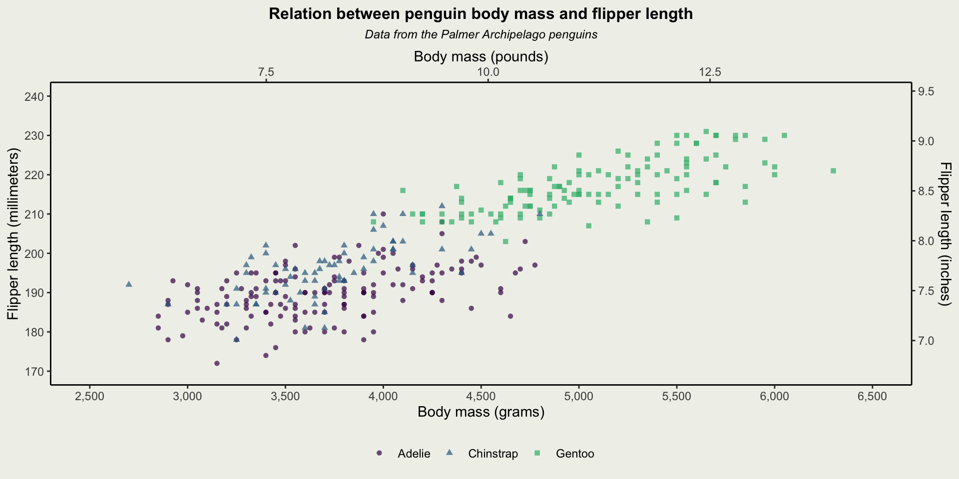
Dual Axes
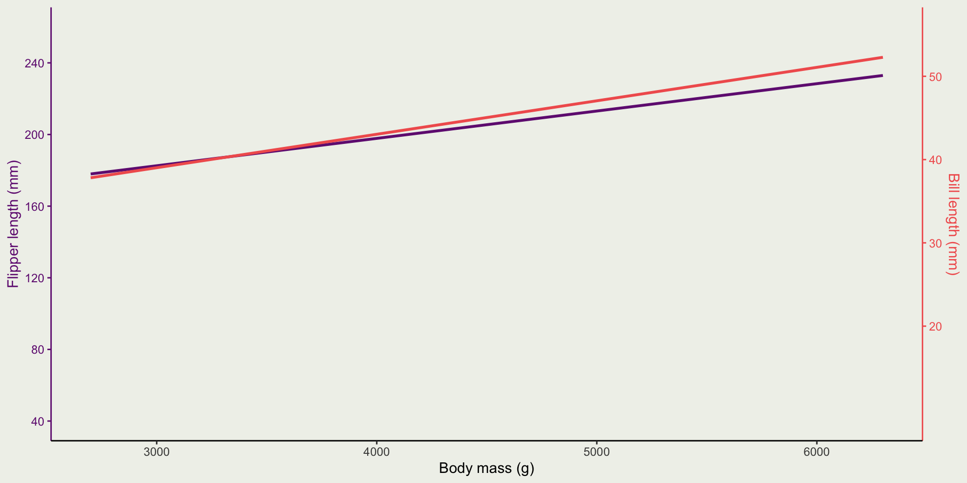
Dual Axes
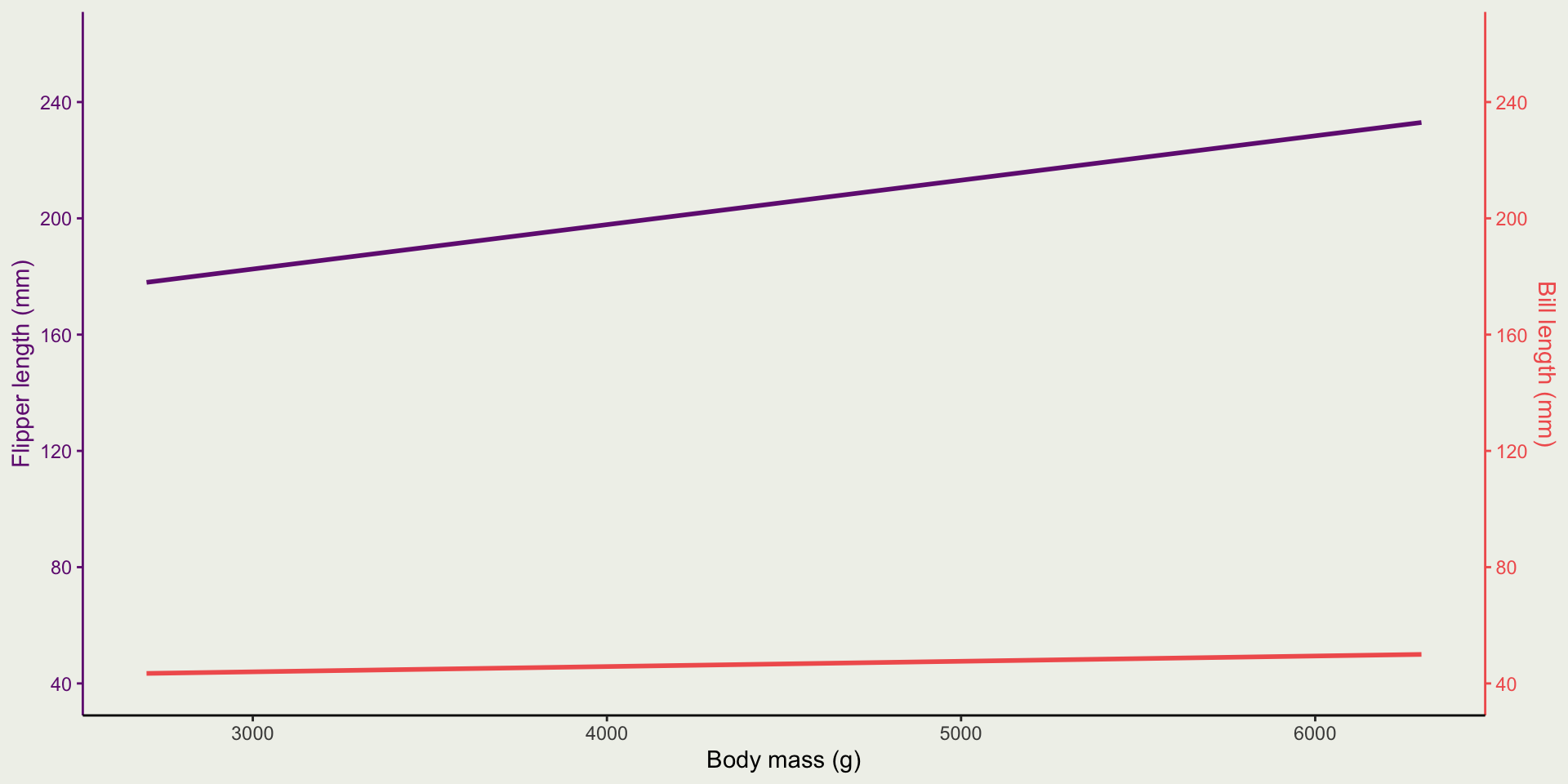
Dual Axes
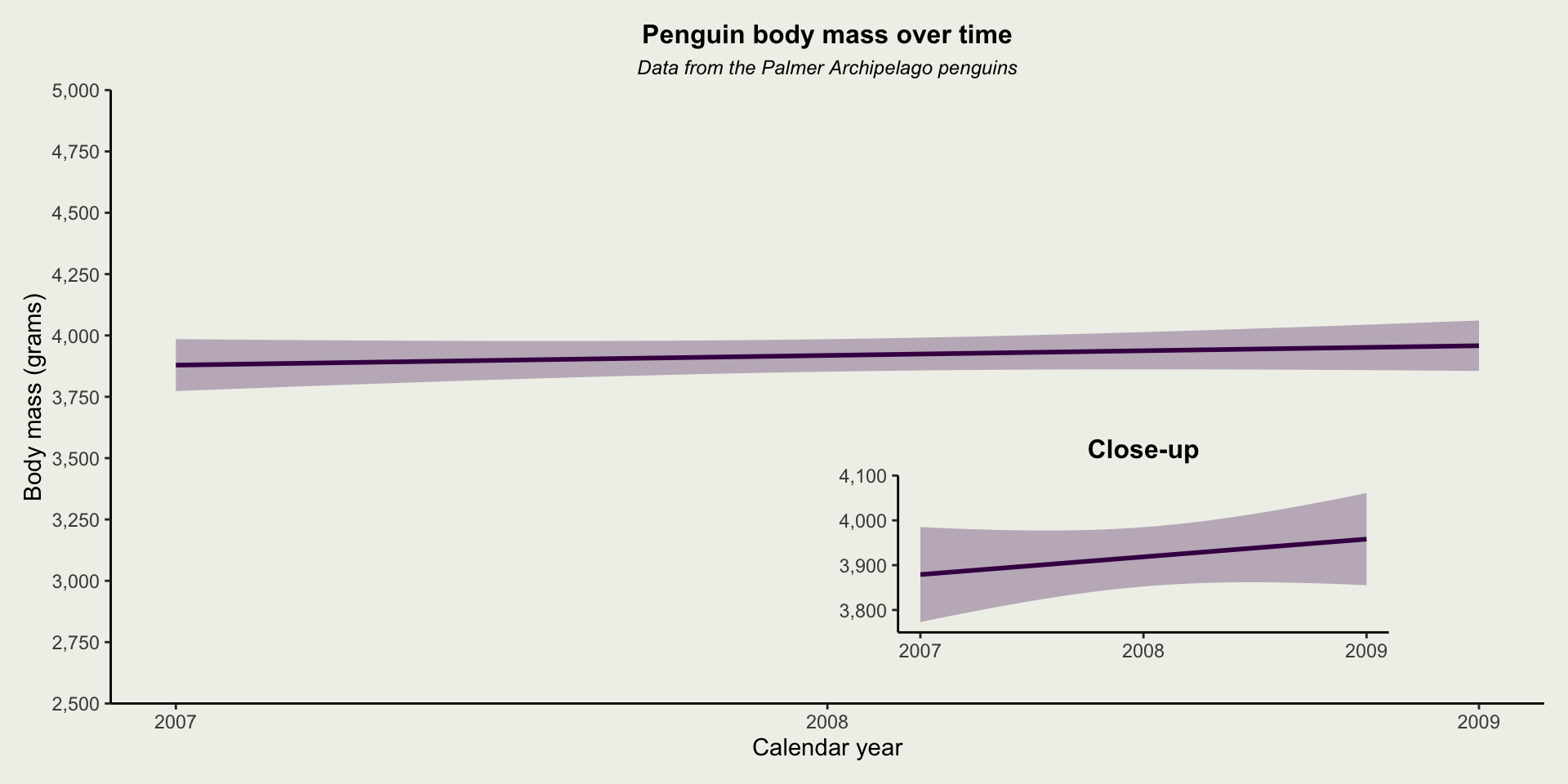
Cutting Corners
Cutting Corners

Cutting Corners
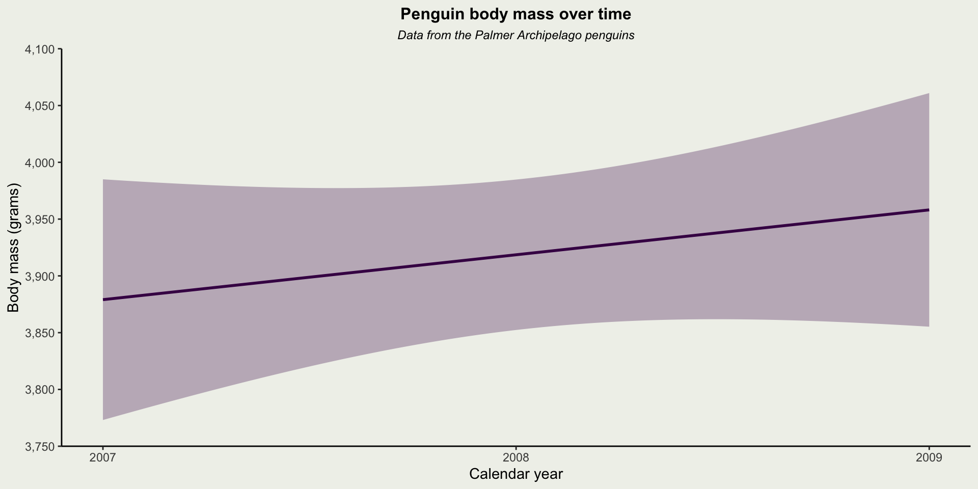
Cutting Corners
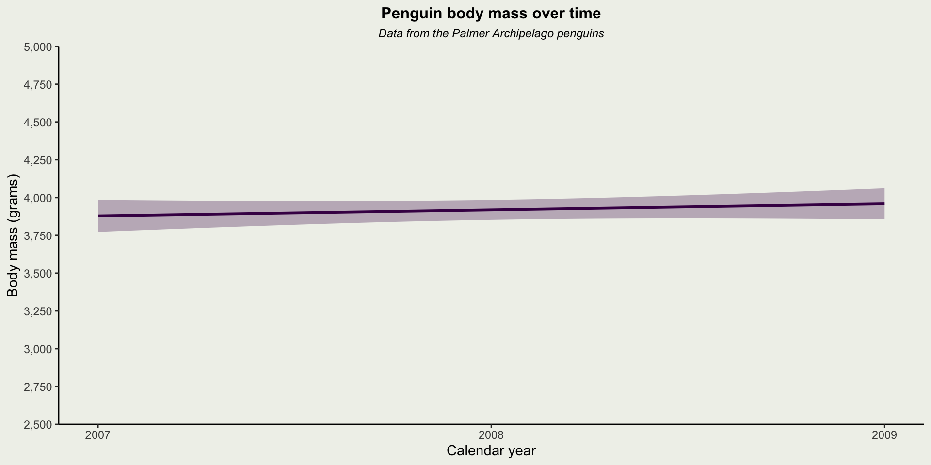
Cutting Corners
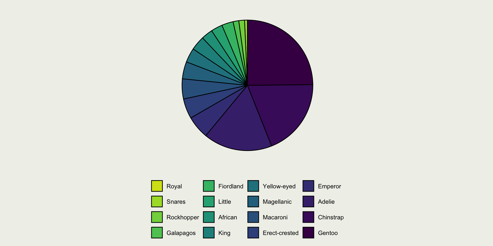
Pie Charts
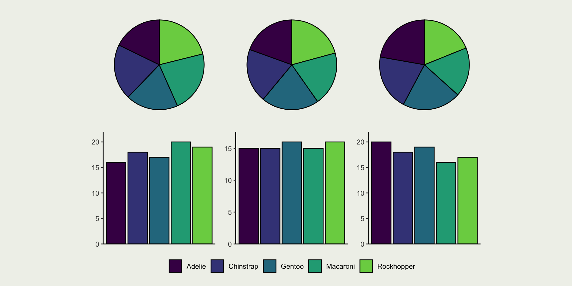
Pie Charts
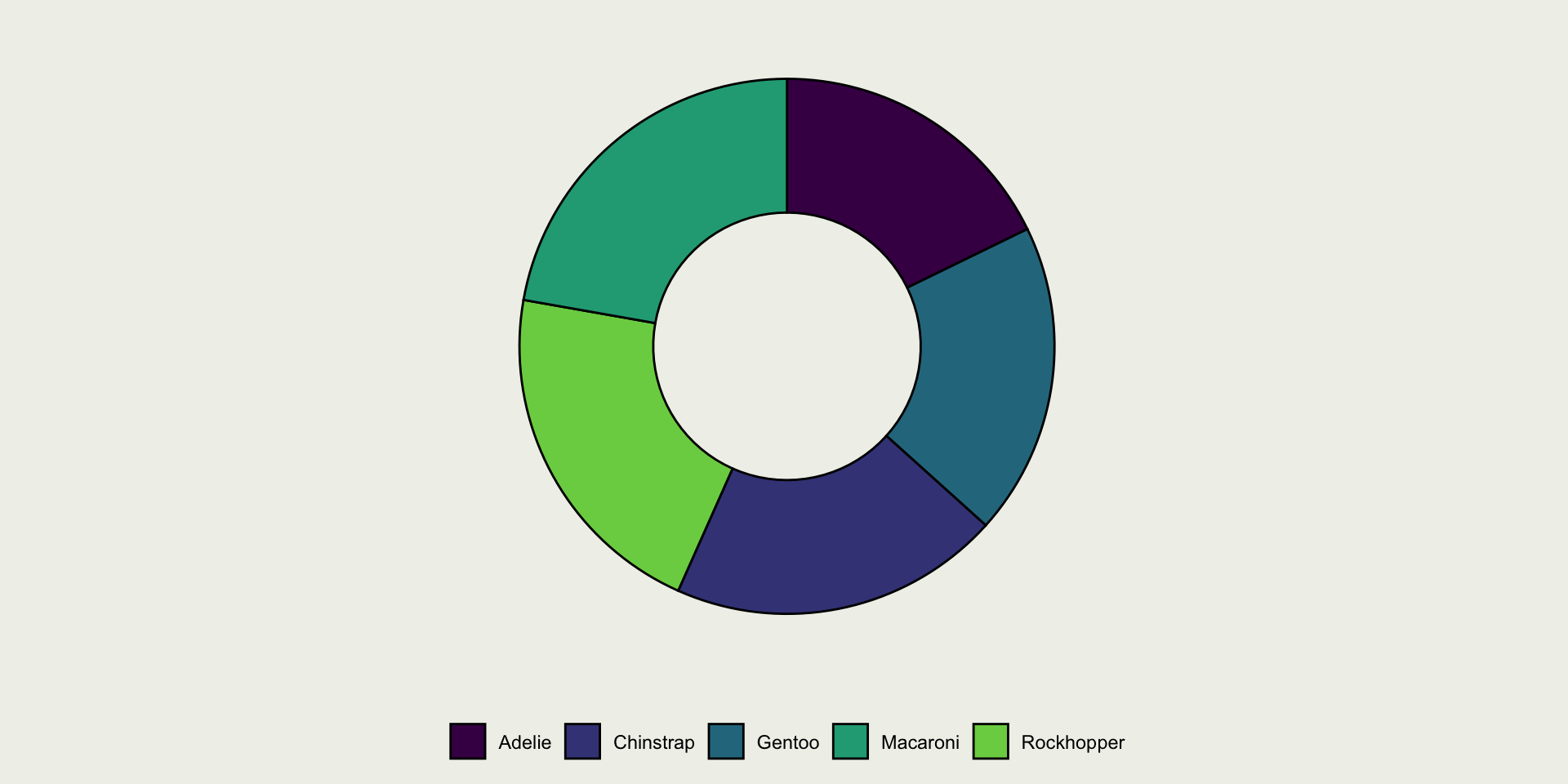
Pie Charts
Spider/Radar Graphs
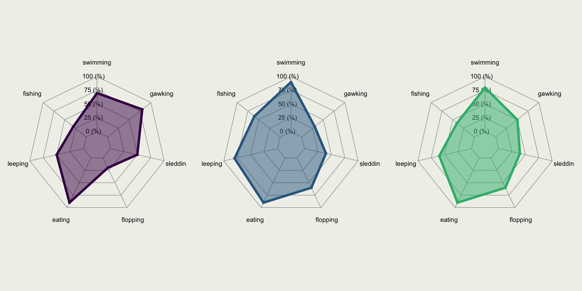
Spider/Radar Graphs
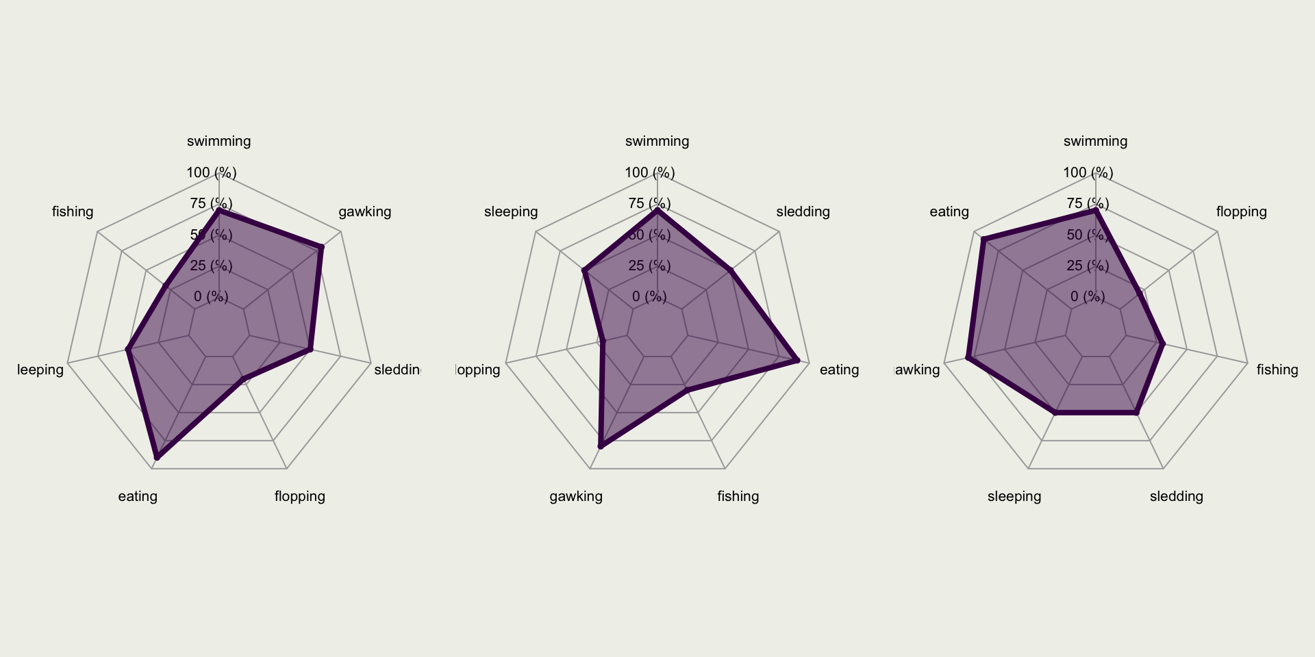
Spider/Radar Graphs
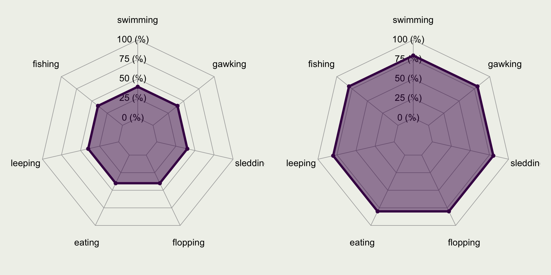
Spider/Radar Graphs
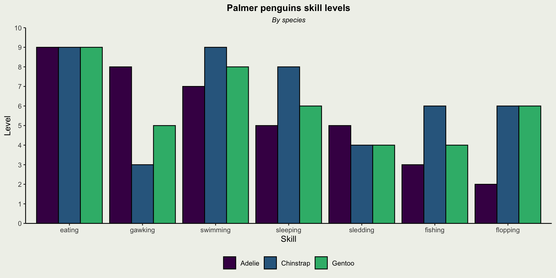
Spider/Radar Graphs
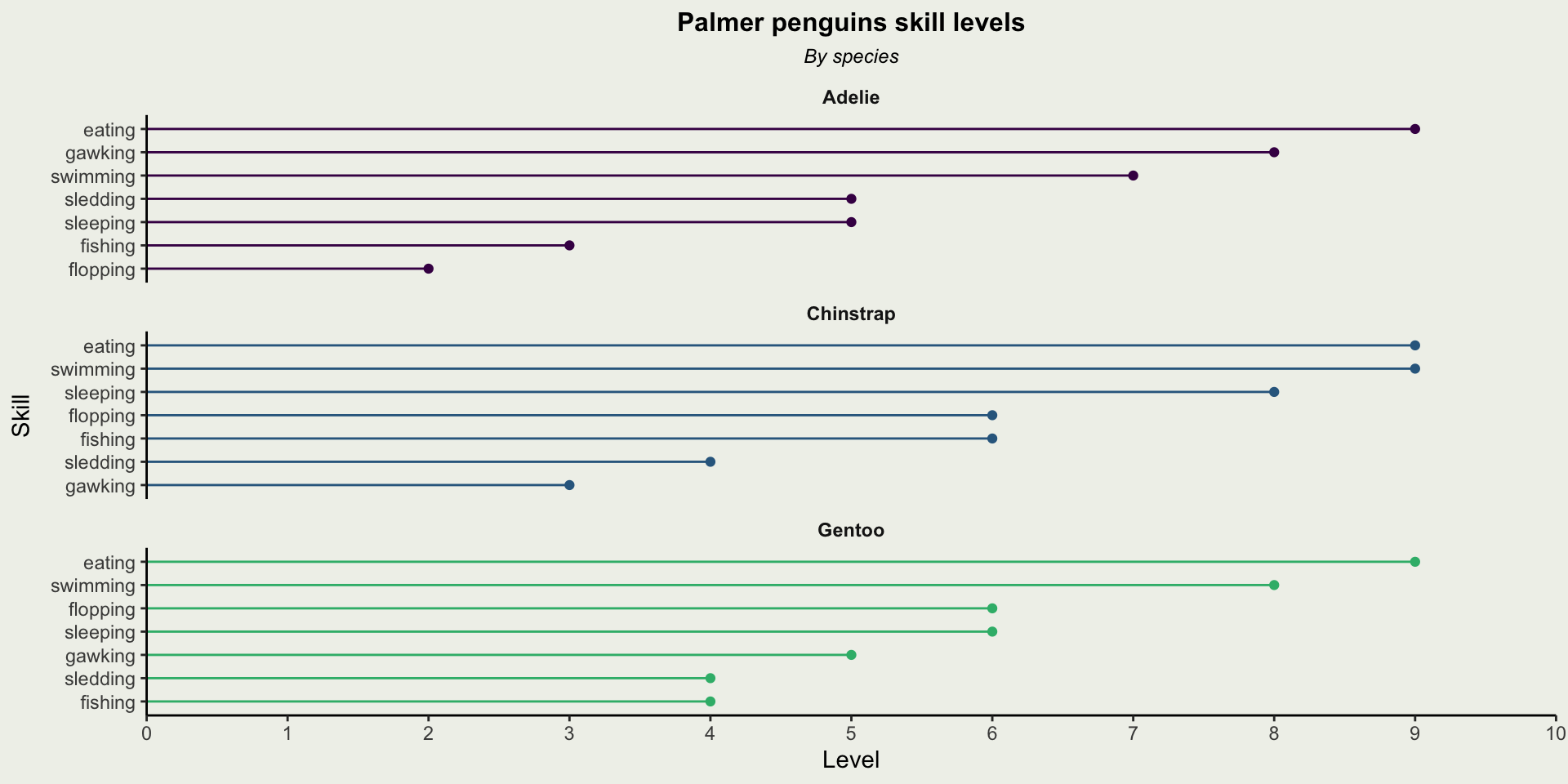
Boxplots
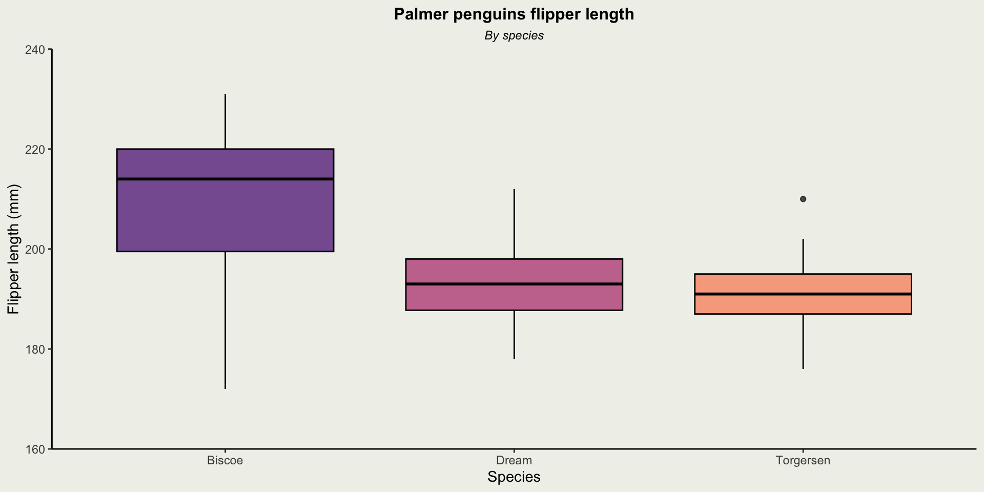
Boxplots
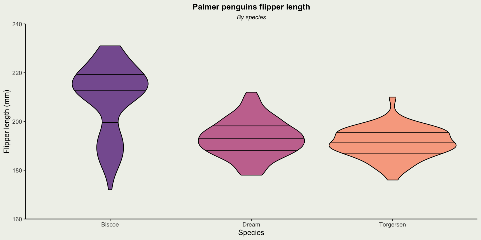
Boxplots
