Plotting
Plotting in R
A lot of analyses are represented by figures in the final papers. Additionally, visualization of data may allow better scrutiny of data patterns. As such, creating figures in R, or ‘plotting’ (because we are making plots).
The way plots are created varies, but two large methods stand out. The first we will (extensively) discuss is implemented by the {ggplot2} package. This package is based on the grammar of graphics, a landmark work on statistical graphics (ergo ‘gg’ for ‘grammar of graphics’). The second method we will (shortly) discuss is the base R plotting, which is part of the R {graphics} package.
As example data, we will use the package {palmerpenguins}, which contains data on 344 penguins from three islands in the Palmer Archipelago, Antarctica (more here).
We will also load the {ggplot2} package. The {graphics} package is installed and loaded by default.
{ggplot2}
Basically, the grammar of graphics provides a foundation that describes how any statistical graphic can be build up, which is based on layers. This layered system gives rise to how the package {ggplot2} allows us to create figures (i.e. plots).
Layer 1: the data
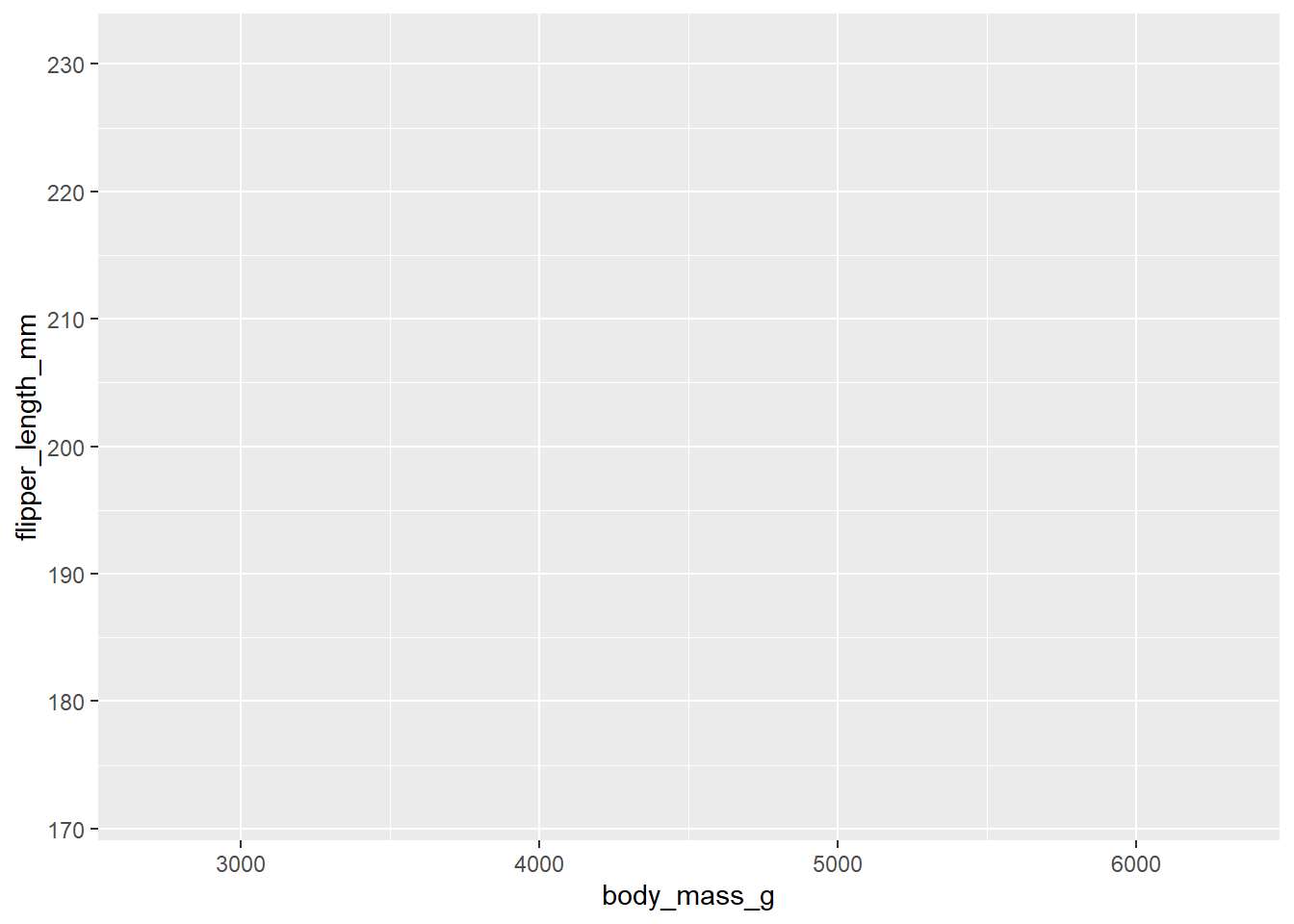
The first layer we specify is the data layer. In this layer, we specify our data and the mapping of the aesthetics, meaning we define what our x-axis will portray, the y-axis, what colours, etc. will portray. This first layer is called using ggplot():
Here, we specified the first argument (data = penguins) to be our dataset. For the second argument (mapping = aes()), we supply a function: aes(). This function allows us to specify what will make up the aesthetics of the graph: the x-axis will be ‘body_mass_g’ and the y-axis will be ‘flipper_length_mm’. Because we did not supply any other layer, we can see that the figure remains largely empty, only having some automatically set limits and titles for the axes.
Layer 2: the geometries
Now we can add the geometries. We are offered a large number of geometries by {ggplot2}, with some basics including points, lines, bars, histograms, rectangles, segments, steps, and ribbons. Each geometry is called by a geom_...() function, such as geom_point() and geom_line().
For our figure, we will add points.
Warning: Removed 2 rows containing missing values or values outside the scale range
(`geom_point()`).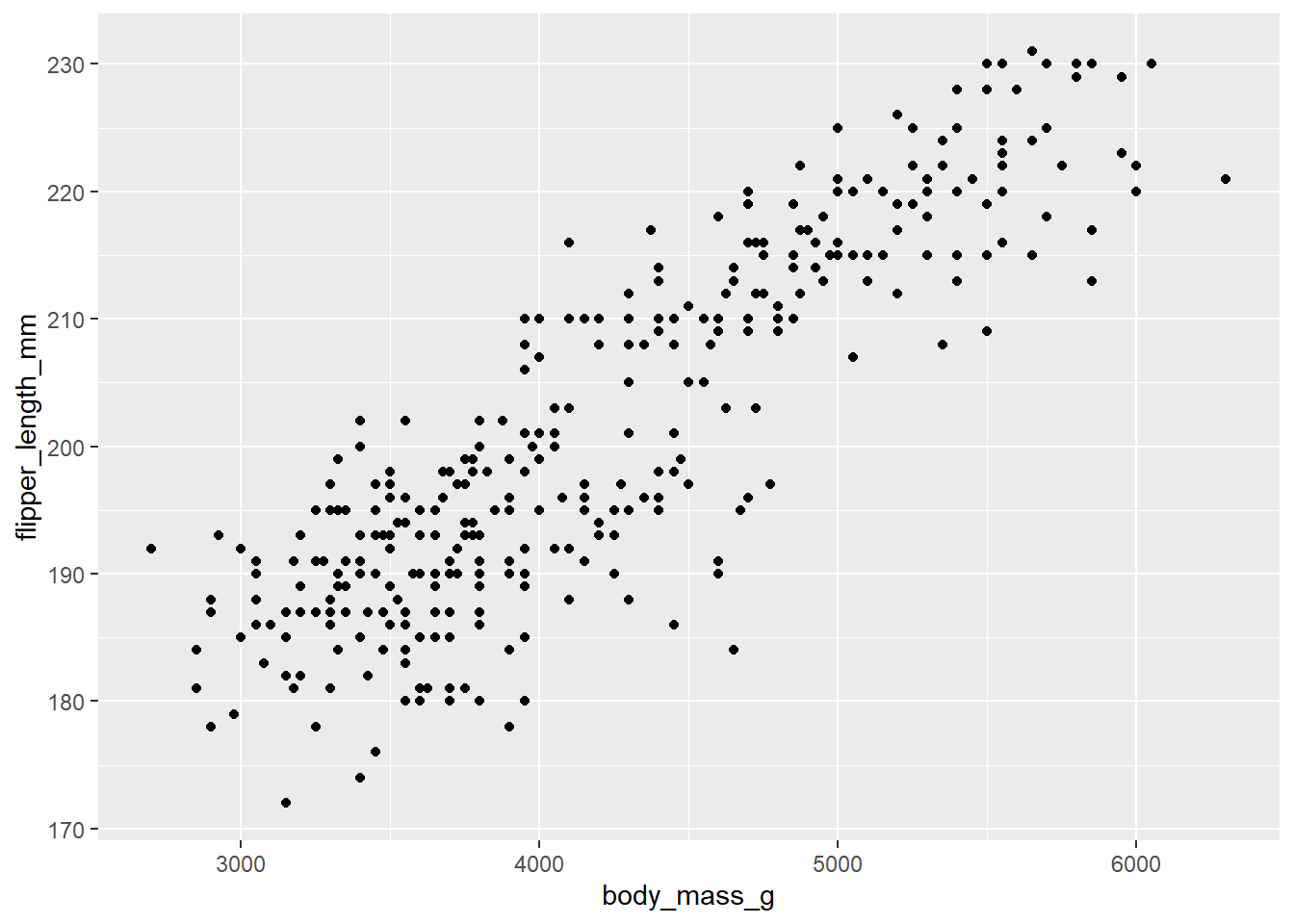
You may notice that layers in these plots are added together by using a plus (+) sign. Additionally, the warning you is just {ggplot2} telling you there were some NA’s that could not be drawn in the plot. Note that this error is also given if you have some values that are outside of the boundaries of your plot.
Within each geometry, we can edit many things, such as the colour, fill (i.e. the colour of shapes that contain an inside), size, alpha (i.e. transparency), and shape (or linetype for lines). Much more is possible, but can be learned from the help functions for each geometry.
Note that any geometry is applied in subsequent order. If we add a trendline (geom_smooth(method = "lm", formula = "y ~ x")), this will be drawn on top of the points if we specify it after geom_point() or before if we specify it before geom_point().
Let’s do this now:
ggplot(penguins, aes(x = body_mass_g, y = flipper_length_mm)) +
# Geometries
geom_point(shape = 5) +
geom_smooth(method = "lm", formula = "y ~ x", colour = "#B58900", fill = "#B58900", alpha = 0.3) Warning: Removed 2 rows containing non-finite outside the scale range
(`stat_smooth()`).Warning: Removed 2 rows containing missing values or values outside the scale range
(`geom_point()`).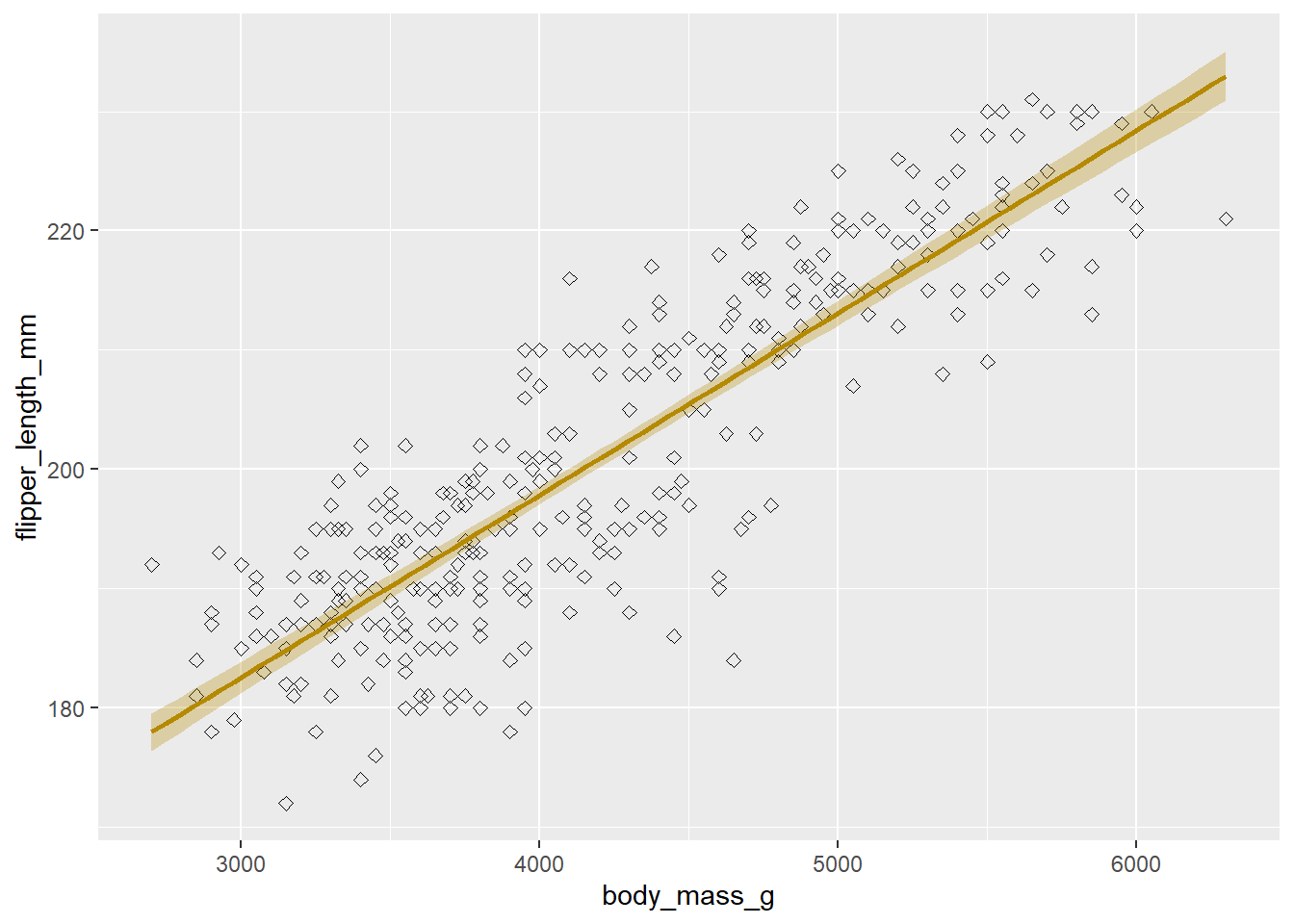
We specified point shape as a number, for which you can find online what different numbers mean. We specified the colour as a hex code, but you can also use the rgb() function for RGB specification, or English language for a number of colours that can be found here. Lastly, we specify the British English colour instead of the American English color. {ggplot2} will accept both, for arguments and for functions (e.g. scale_color_manual() and scale_colour_manual() both exist and do the same thing). We will revert the points back to their default for the remainder of the plot.
Layer 3: the scaling
For the third layer, we will apply scaling, which means we will edit anything that can be a scale (e.g. axes, colours, fill).
Note that we deviate from the grammar of graphics in building our plot. The order in which we specify our layers does not adhere to the grammar of graphics. Luckily, in the background, {ggplot2} ignores this, only keeping the order in which we called geometries for geometries, but for instance not drawing theming prior to geometries, even if we specify so.
Axes
In our current plot, we have two scales: the x-axis and y-axis. We can edit these using scale functions that concur with the scale type (i.e. continuous, discrete, etc.). In our case, both scales are continuous, so we will use scale_x_continuous() and scale_y_continuous(). For other types of scales, we might also use scale_x_discrete(), scale_x_date(), etc.
ggplot(penguins, aes(x = body_mass_g, y = flipper_length_mm)) +
    # Geometries
geom_point() +
geom_smooth(method = "lm", formula = "y ~ x", colour = "#B58900", fill = "#B58900", alpha = 0.3) +
# Scaling
scale_x_continuous(name = "Body mass (grams)",
limits = c(2500, 6500),
breaks = seq(2500, 6500, 500),
labels = prettyNum(seq(2500, 6500, 500), big.mark = ",")) +
scale_y_continuous(name = "Flipper length (millimeters)",
limits = c(170, 240),
breaks = seq(170, 240, 10)) Warning: Removed 2 rows containing non-finite outside the scale range
(`stat_smooth()`).Warning: Removed 2 rows containing missing values or values outside the scale range
(`geom_point()`).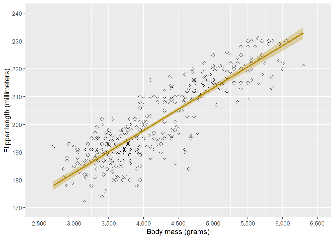
In the scale functions, we can give the name of the axis, the limits of the axis, at which points there should be ticks (breaks), and the labels given to each tick.
One more thing we can do in the scale functions is determine the expansion. By default, {ggplot2} expands the axes a bit so that the figure does not seem too cropped. Sometimes, however, we might want to remove or change this. If we want to remove this, we can use expand = c(0, 0) in the scaling arguments for each axis:
ggplot(penguins, aes(x = body_mass_g, y = flipper_length_mm)) +
    # Geometries
    geom_point() +
    geom_smooth(method = "lm", formula = "y ~ x", colour = "#B58900", fill = "#B58900", alpha = 0.3) +
    # Scaling
    scale_x_continuous(name = "Body mass (grams)",
                       limits = c(2500, 6500),
                       breaks = seq(2500, 6500, 500),
                       labels = prettyNum(seq(2500, 6500, 500), big.mark = ","),
                       expand = c(0, 0)) +
    scale_y_continuous(name = "Flipper length (millimeters)",
                       limits = c(170, 240),
                       breaks = seq(170, 240, 10))
Warning: Removed 2 rows containing non-finite outside the scale range
(`stat_smooth()`).Warning: Removed 2 rows containing missing values or values outside the scale range
(`geom_point()`).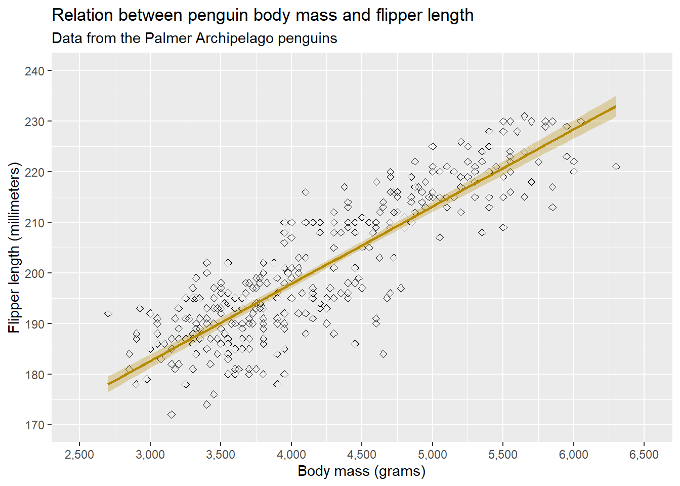
Above we only removed the expansion for the y-axis. We can also change the amount of expansion (by addition or multiplication) by supplying the expansion() function to the expand = argument. We will leave the expansion to its default again while working on our example.
Aesthetics
Besides scaling the axes, we can also specify specific scales of our plot. Before we do that, let’s go through the different scales we can define in aes():
colour(orcolor): this defines the colour of all geometries. For geometries with an inside area,colourwill only colour the outside/circumference.fill: this defines the colour of the inside of all geometries.linetype: for any geometry that draws a line, this defines the linetype.size: this determines the line of certain geometries, such as points.
There are a number of other scales, but these are the most important to understand the basics.
Let’s stratify the plots by island. To do this, we can specify that colour, fill, and linetype should be different for the different levels of island. We can do this in the aes() function. Note that we will remove the colour and fill specification in geom_smooth() as these are now specified in aes().
ggplot(penguins, aes(x = body_mass_g, y = flipper_length_mm, colour = island, fill = island, linetype = island)) +
    # Geometries
    geom_point() +
    geom_smooth(method = "lm", formula = "y ~ x", , alpha = 0.3) +
    # Scaling
    scale_x_continuous(name = "Body mass (grams)",
                       limits = c(2500, 6500),
                       breaks = seq(2500, 6500, 500),
                       labels = prettyNum(seq(2500, 6500, 500), big.mark = ","),
                       expand = c(0, 0)) +
    scale_y_continuous(name = "Flipper length (millimeters)",
                       limits = c(170, 240),
                       breaks = seq(170, 240, 10))
Warning: Removed 2 rows containing non-finite outside the scale range
(`stat_smooth()`).Warning: Removed 2 rows containing missing values or values outside the scale range
(`geom_point()`).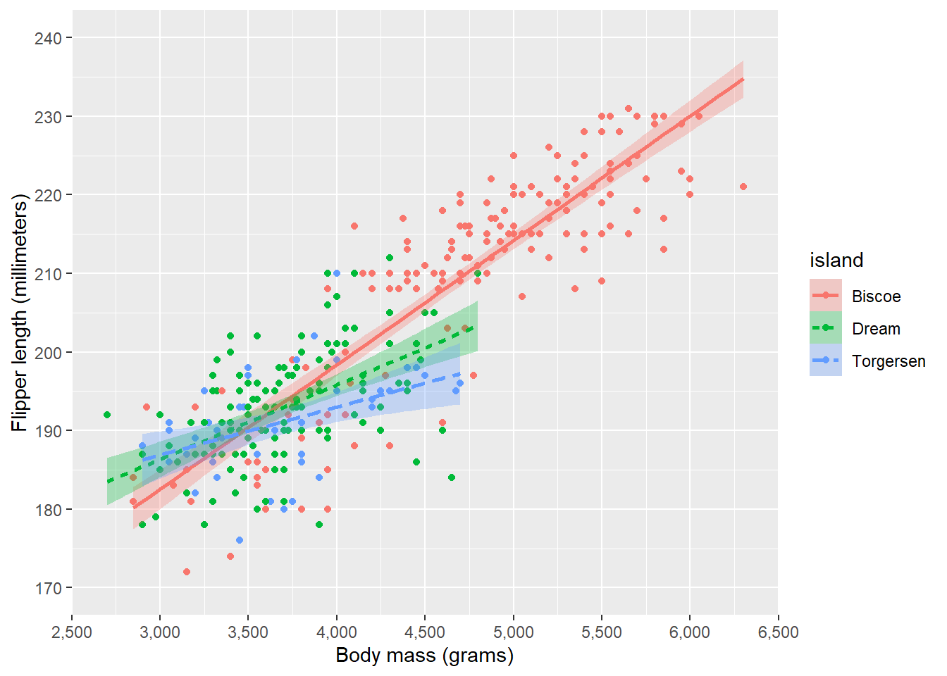
As you can see, {ggplot2} automatically selected colours for us, as well as create a legend, and perform any statistical operations (such as the LOESS smoother) within groups.
Now we can use scales to change these scales to our preferences:
ggplot(penguins, aes(x = body_mass_g, y = flipper_length_mm, colour = island, fill = island, linetype = island)) +
    # Geometries
    geom_point() +
    geom_smooth(method = "lm", formula = "y ~ x", , alpha = 0.3) +
    # Scaling
    scale_x_continuous(name = "Body mass (grams)",
                       limits = c(2500, 6500),
                       breaks = seq(2500, 6500, 500),
                       labels = prettyNum(seq(2500, 6500, 500), big.mark = ","),
                       expand = c(0, 0)) +
    scale_y_continuous(name = "Flipper length (millimeters)",
                       limits = c(170, 240),
                       breaks = seq(170, 240, 10)) +
    scale_colour_manual(values = c("darkorange", "purple", "cyan4"), aesthetics = c("colour", "fill")) +
    scale_linetype_manual(values = c(2, 4, 6))
Warning: Removed 2 rows containing non-finite outside the scale range
(`stat_smooth()`).Warning: Removed 2 rows containing missing values or values outside the scale range
(`geom_point()`).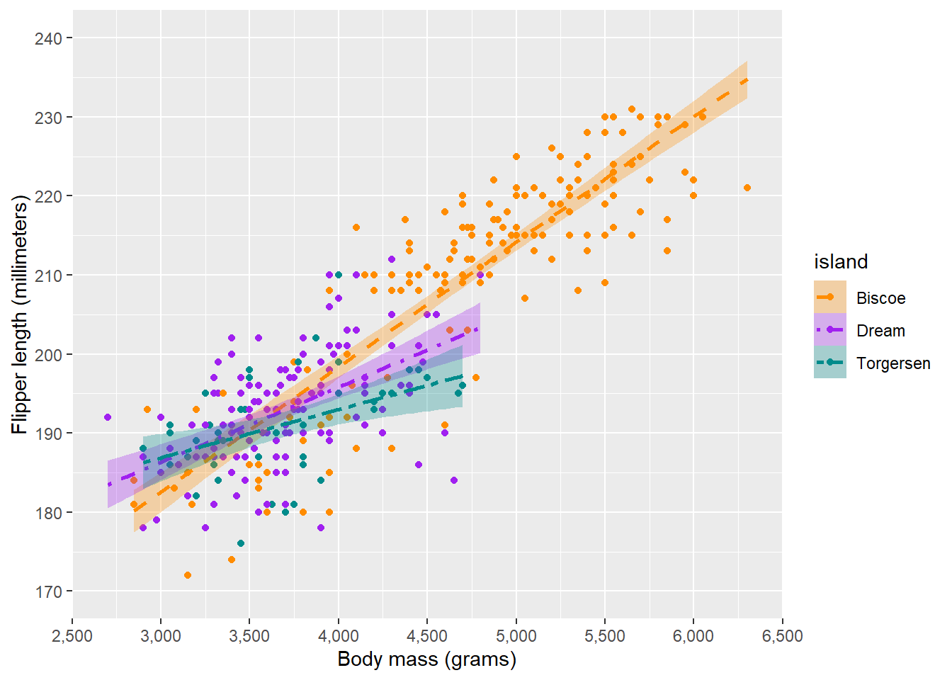
Note that we specify aesthetics = in the colour scale, which allows us to use one scale for both colour and fill. Of course, we can also separately specify scale_fill_manual().
There are also implementations of well-known palettes for colours, for instance viridis which is a palette distinguishable also for people with the most common types of colourblindness:
ggplot(penguins, aes(x = body_mass_g, y = flipper_length_mm, colour = island, fill = island, linetype = island)) +
    # Geometries
    geom_point() +
    geom_smooth(method = "lm", formula = "y ~ x", , alpha = 0.3) +
    # Scaling
    scale_x_continuous(name = "Body mass (grams)",
                       limits = c(2500, 6500),
                       breaks = seq(2500, 6500, 500),
                       labels = prettyNum(seq(2500, 6500, 500), big.mark = ","),
                       expand = c(0, 0)) +
    scale_y_continuous(name = "Flipper length (millimeters)",
                       limits = c(170, 240),
                       breaks = seq(170, 240, 10)) +
    scale_colour_viridis_d(aesthetics = c("fill", "colour")) +
    scale_linetype_manual(values = c(2, 4, 6))
Warning: Removed 2 rows containing non-finite outside the scale range
(`stat_smooth()`).Warning: Removed 2 rows containing missing values or values outside the scale range
(`geom_point()`).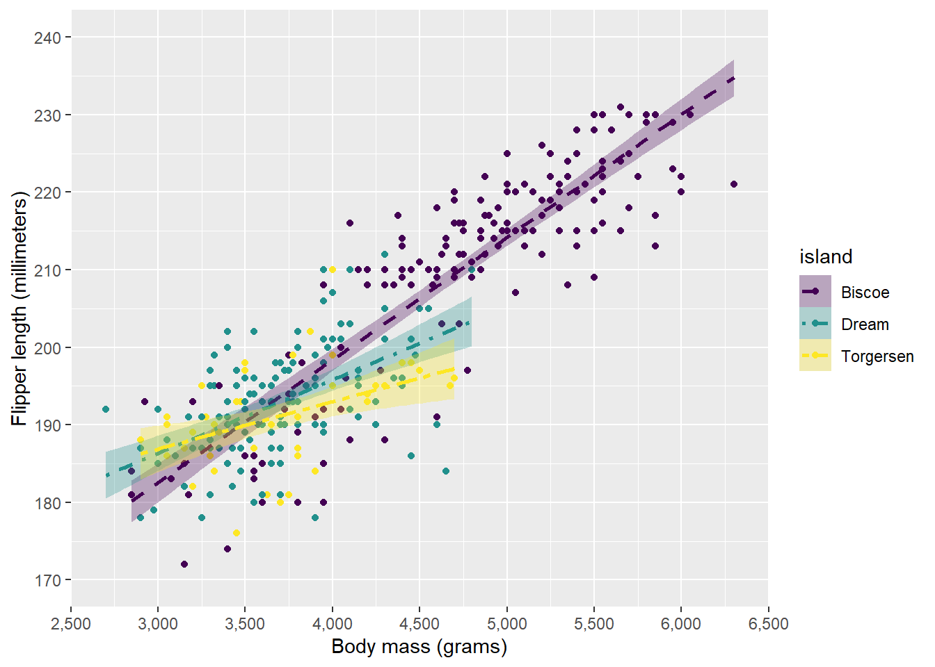
Linetypes can again be specified as numbers or text, for which a guide can be found here.
Layer 4: labels
In the next layer, we will apply labels to the plot, which includes the title, subtitle, axes labels, and legends.
For the axes labels, we can use xlab() and ylab() respectively. We won’t need these as we specified the name already in the scaling function, but they might be useful if you do not need the scale function. The title can be specified using the ggtitle() function, which also allows you to specify a subtitle. Alternatively, this can be done through the labs() function, which allows much more control, such as a tag (for multipanel labels where you want to tag A, B, C, etc.), a caption, and alt text (for accessibility purposes).
For the plot we’re building, we will aply a title and a subtitle.
ggplot(penguins, aes(x = body_mass_g, y = flipper_length_mm, colour = island, fill = island, linetype = island)) +
    # Geometries
    geom_point() +
    geom_smooth(method = "lm", formula = "y ~ x", , alpha = 0.3) +
    # Scaling
    scale_x_continuous(name = "Body mass (grams)",
                       limits = c(2500, 6500),
                       breaks = seq(2500, 6500, 500),
                       labels = prettyNum(seq(2500, 6500, 500), big.mark = ","),
                       expand = c(0, 0)) +
    scale_y_continuous(name = "Flipper length (millimeters)",
                       limits = c(170, 240),
                       breaks = seq(170, 240, 10)) +
    scale_colour_manual(values = c("darkorange", "purple", "cyan4"), aesthetics = c("colour", "fill")) +
    scale_linetype_manual(values = c(2, 4, 6))  +
    # Labels
    ggtitle("Relation between penguin body mass and flipper length",
            subtitle = "Data from the Palmer Archipelago penguins")
Warning: Removed 2 rows containing non-finite outside the scale range
(`stat_smooth()`).Warning: Removed 2 rows containing missing values or values outside the scale range
(`geom_point()`).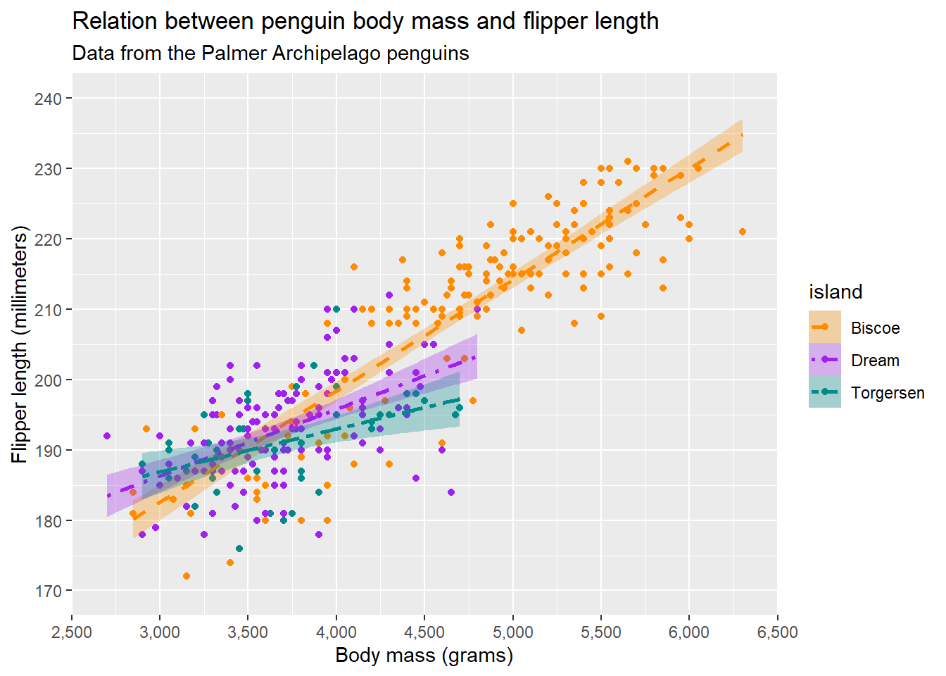
Additionally, we can edit the legend by using guide(). guide() let’s us specify details about the legend for each scale that we used. In our case, we used colour, fill, and linetype. Imagine that we wanted to remove the legend for fill (which is combined with linetype and colour because they are based on the same variable), we can simply do:
ggplot(penguins, aes(x = body_mass_g, y = flipper_length_mm, colour = island, fill = island, linetype = island)) +
    # Geometries
    geom_point() +
    geom_smooth(method = "lm", formula = "y ~ x", , alpha = 0.3) +
    # Scaling
    scale_x_continuous(name = "Body mass (grams)",
                       limits = c(2500, 6500),
                       breaks = seq(2500, 6500, 500),
                       labels = prettyNum(seq(2500, 6500, 500), big.mark = ","),
                       expand = c(0, 0)) +
    scale_y_continuous(name = "Flipper length (millimeters)",
                       limits = c(170, 240),
                       breaks = seq(170, 240, 10)) +
    scale_colour_manual(values = c("darkorange", "purple", "cyan4"), aesthetics = c("colour", "fill")) +
    scale_linetype_manual(values = c(2, 4, 6))  +
    # Labels
    ggtitle("Relation between penguin body mass and flipper length",
            subtitle = "Data from the Palmer Archipelago penguins") +
    guides(fill = "none")
Warning: Removed 2 rows containing non-finite outside the scale range
(`stat_smooth()`).Warning: Removed 2 rows containing missing values or values outside the scale range
(`geom_point()`).
Additionally, we can specify that we want the legend to take a different form (e.g. colourbar). We can also further modify the legend with guide_legend():
ggplot(penguins, aes(x = body_mass_g, y = flipper_length_mm, colour = island, fill = island, linetype = island)) +
    # Geometries
    geom_point() +
    geom_smooth(method = "lm", formula = "y ~ x", , alpha = 0.3) +
    # Scaling
    scale_x_continuous(name = "Body mass (grams)",
                       limits = c(2500, 6500),
                       breaks = seq(2500, 6500, 500),
                       labels = prettyNum(seq(2500, 6500, 500), big.mark = ","),
                       expand = c(0, 0)) +
    scale_y_continuous(name = "Flipper length (millimeters)",
                       limits = c(170, 240),
                       breaks = seq(170, 240, 10)) +
    scale_colour_manual(values = c("darkorange", "purple", "cyan4"), aesthetics = c("colour", "fill")) +
    scale_linetype_manual(values = c(2, 4, 6))  +
    # Labels
    ggtitle("Relation between penguin body mass and flipper length",
            subtitle = "Data from the Palmer Archipelago penguins") +
    guides(fill = "none",
           colour = guide_legend(ncol = 2, position = "bottom"))
Warning: Removed 2 rows containing non-finite outside the scale range
(`stat_smooth()`).Warning: Removed 2 rows containing missing values or values outside the scale range
(`geom_point()`).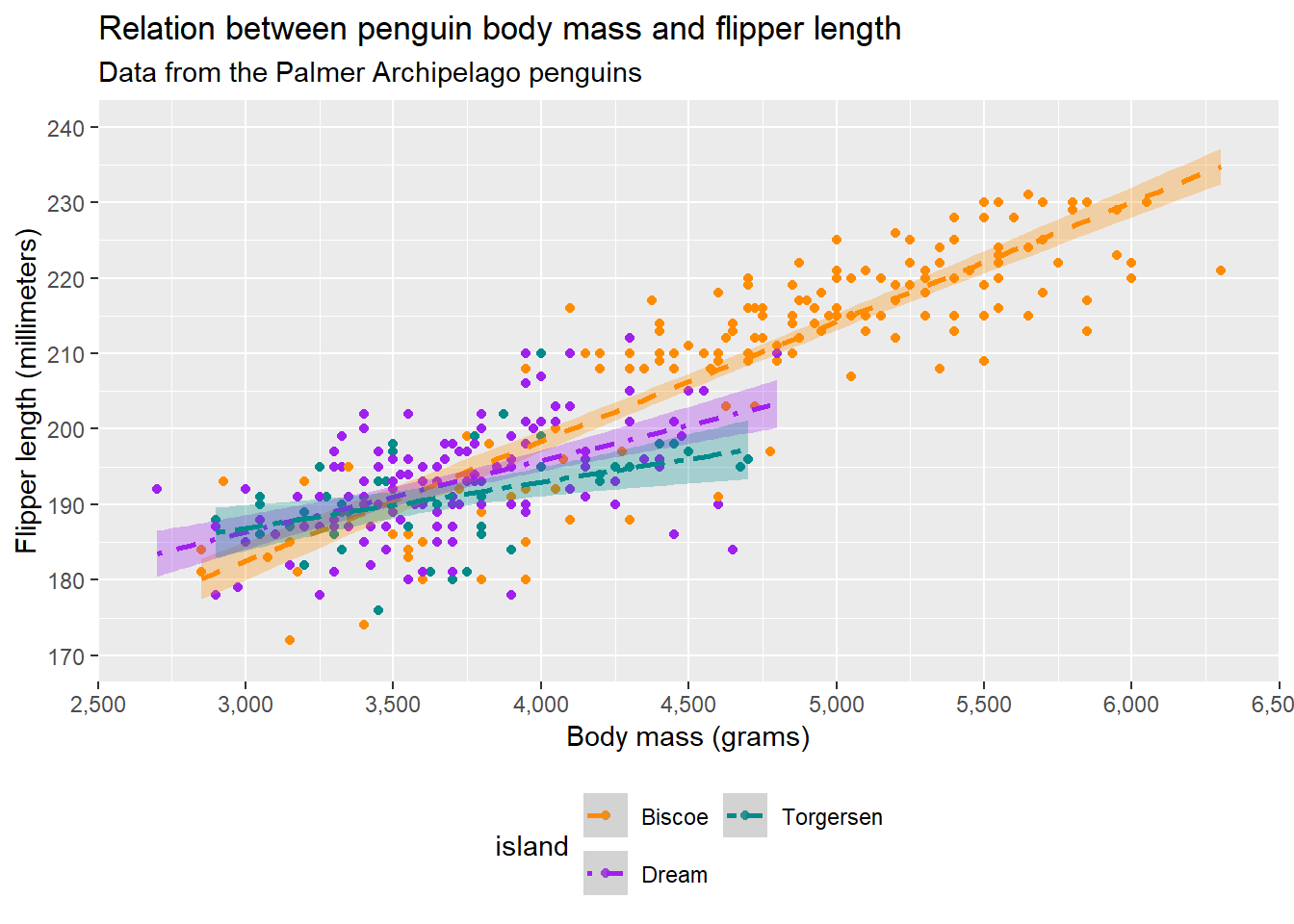
Note that we can also specify guide_legend() within scale functions.
Layer 5: coordinates and transformations
coord_cartesian()
We have already seen that we can limit our axes using the limits argument in the scaling functions. However, if we limit our axis too much, data that falls outside of this range will be removed. If we want to limit the axes without data being removed, we can use the arguments xlim = and ylim = in the function coord_cartesian(). As an example:
ggplot(penguins, aes(x = body_mass_g, y = flipper_length_mm, colour = island, fill = island, linetype = island)) +
    # Geometries
    geom_point() +
    geom_smooth(method = "lm", formula = "y ~ x", , alpha = 0.3) +
    # Scaling
    scale_x_continuous(name = "Body mass (grams)",
                       limits = c(2500, 6500),
                       breaks = seq(2500, 6500, 500),
                       labels = prettyNum(seq(2500, 6500, 500), big.mark = ","),
                       expand = c(0, 0)) +
    scale_y_continuous(name = "Flipper length (millimeters)",
                       limits = c(170, 240),
                       breaks = seq(170, 240, 10)) +
    scale_colour_manual(values = c("darkorange", "purple", "cyan4"), aesthetics = c("colour", "fill")) +
    scale_linetype_manual(values = c(2, 4, 6))  +
    # Labels
    ggtitle("Relation between penguin body mass and flipper length", subtitle = "Data from the Palmer Archipelago penguins") +
    guides(fill = "none",
           colour = guide_legend(ncol = 2, position = "bottom")) +
    # Transformations
    coord_cartesian(xlim = c(3000, 5000))
Warning: Removed 2 rows containing non-finite outside the scale range
(`stat_smooth()`).Warning: Removed 2 rows containing missing values or values outside the scale range
(`geom_point()`).
Note that now the panel is cropped on the x-axis according to coord_cartesian(), but that our data has remained. This is for instance useful when we have some confidence intervals that become very broad but we do not want to show the range of the y-axis over the whole range of the confidence interval. For now, we will leave it out, but it’s good to have it in our toolbox.
facet_grid() and facet_panel()
Sometimes, instead of using scales, we might want to show different groups using facets. This is where facet_grid() and facet_wrap() come in handy. If we have just one variable on which we want to stratify, we can create facets using facet_wrap():
ggplot(penguins, aes(x = body_mass_g, y = flipper_length_mm, colour = island, fill = island, linetype = island)) +
    # Geometries
    geom_point() +
    geom_smooth(method = "lm", formula = "y ~ x", , alpha = 0.3) +
    # Scaling
    scale_x_continuous(name = "Body mass (grams)",
                       limits = c(2500, 6500),
                       breaks = seq(2500, 6500, 500),
                       labels = prettyNum(seq(2500, 6500, 500), big.mark = ","),
                       expand = c(0, 0)) +
    scale_y_continuous(name = "Flipper length (millimeters)",
                       limits = c(170, 240),
                       breaks = seq(170, 240, 10)) +
    scale_colour_manual(values = c("darkorange", "purple", "cyan4"), aesthetics = c("colour", "fill")) +
    scale_linetype_manual(values = c(2, 4, 6))  +
    # Labels
    ggtitle("Relation between penguin body mass and flipper length", subtitle = "Data from the Palmer Archipelago penguins") +
    guides(fill = "none",
           colour = guide_legend(ncol = 2, position = "bottom")) +
    # Transformations
    facet_wrap(vars(island))
Warning: Removed 2 rows containing non-finite outside the scale range
(`stat_smooth()`).Warning: Removed 2 rows containing missing values or values outside the scale range
(`geom_point()`).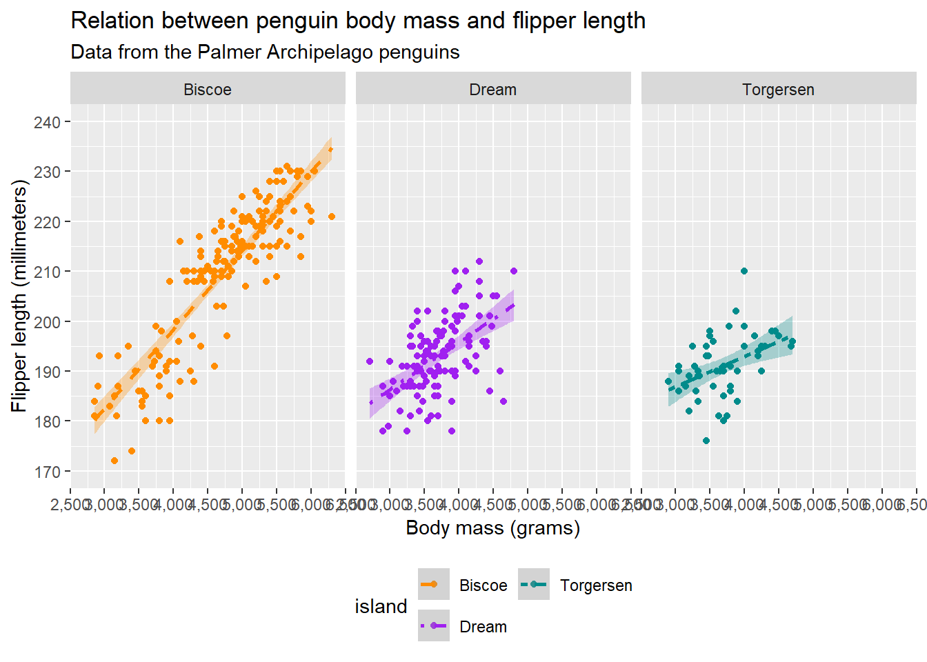
If we have multiply varialbes, facet_grid() can help us out:
ggplot(penguins, aes(x = body_mass_g, y = flipper_length_mm, colour = island, fill = island, linetype = island)) +
    # Geometries
    geom_point() +
    geom_smooth(method = "lm", formula = "y ~ x", , alpha = 0.3) +
    # Scaling
    scale_x_continuous(name = "Body mass (grams)",
                       limits = c(2500, 6500),
                       breaks = seq(2500, 6500, 500),
                       labels = prettyNum(seq(2500, 6500, 500), big.mark = ","),
                       expand = c(0, 0)) +
    scale_y_continuous(name = "Flipper length (millimeters)",
                       limits = c(170, 240),
                       breaks = seq(170, 240, 10)) +
    scale_colour_manual(values = c("darkorange", "purple", "cyan4"), aesthetics = c("colour", "fill")) +
    scale_linetype_manual(values = c(2, 4, 6))  +
    # Labels
    ggtitle("Relation between penguin body mass and flipper length", subtitle = "Data from the Palmer Archipelago penguins") +
    guides(fill = "none",
           colour = guide_legend(ncol = 2, position = "bottom")) +
    # Transformations
    facet_grid(rows = vars(species), cols = vars(island))
Warning: Removed 2 rows containing non-finite outside the scale range
(`stat_smooth()`).Warning: Removed 2 rows containing missing values or values outside the scale range
(`geom_point()`).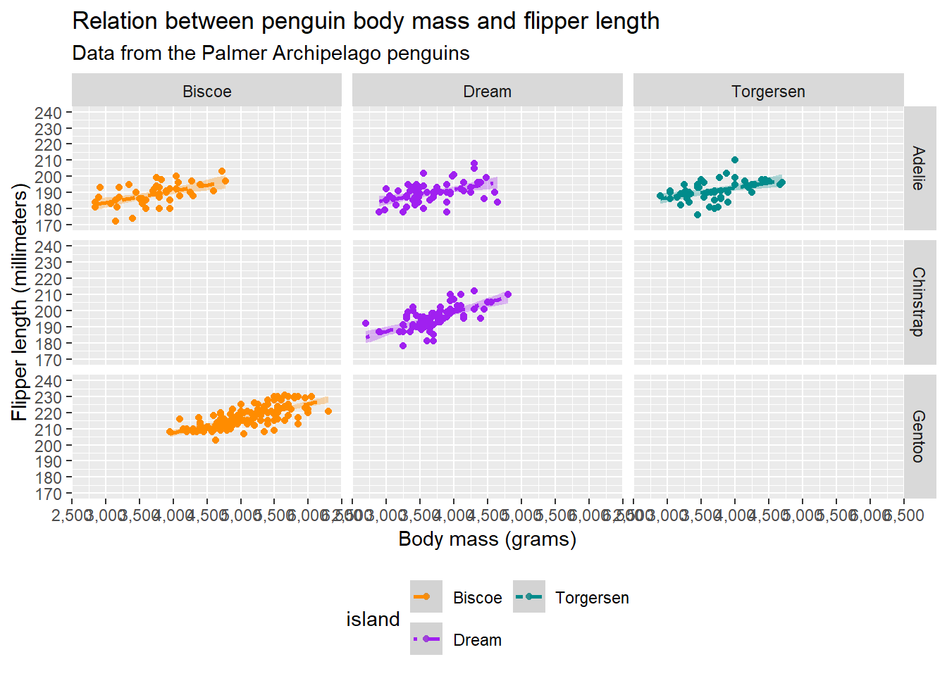
In the facet functions, you can specify multiple things, including the labels given to the strips at the top and whether the axes should be allowed to differ between plots (which can be useful if you just want to create facets of a lot of histograms to show distributions).
Note that we still specified our scales such as colour, but that this is not required.
Layer 6: theme
The last layer we will discuss is the theme. {ggplot2} allows us to edit the aesthetics of the plot using theme() and offers some basic themes. For instance, we can just make a simple looking plot using theme_bw():
ggplot(penguins, aes(x = body_mass_g, y = flipper_length_mm, colour = island, fill = island, linetype = island)) +
    # Geometries
    geom_point() +
    geom_smooth(method = "lm", formula = "y ~ x", , alpha = 0.3) +
    # Scaling
    scale_x_continuous(name = "Body mass (grams)",
                       limits = c(2500, 6500),
                       breaks = seq(2500, 6500, 500),
                       labels = prettyNum(seq(2500, 6500, 500), big.mark = ","),
                       expand = c(0, 0)) +
    scale_y_continuous(name = "Flipper length (millimeters)",
                       limits = c(170, 240),
                       breaks = seq(170, 240, 10)) +
    scale_colour_manual(values = c("darkorange", "purple", "cyan4"), aesthetics = c("colour", "fill")) +
    scale_linetype_manual(values = c(2, 4, 6))  +
    # Labels
    ggtitle("Relation between penguin body mass and flipper length", subtitle = "Data from the Palmer Archipelago penguins") +
    guides(fill = "none",
           colour = guide_legend(ncol = 2, position = "bottom")) +
    # Aesthetics
    theme_bw()
Warning: Removed 2 rows containing non-finite outside the scale range
(`stat_smooth()`).Warning: Removed 2 rows containing missing values or values outside the scale range
(`geom_point()`).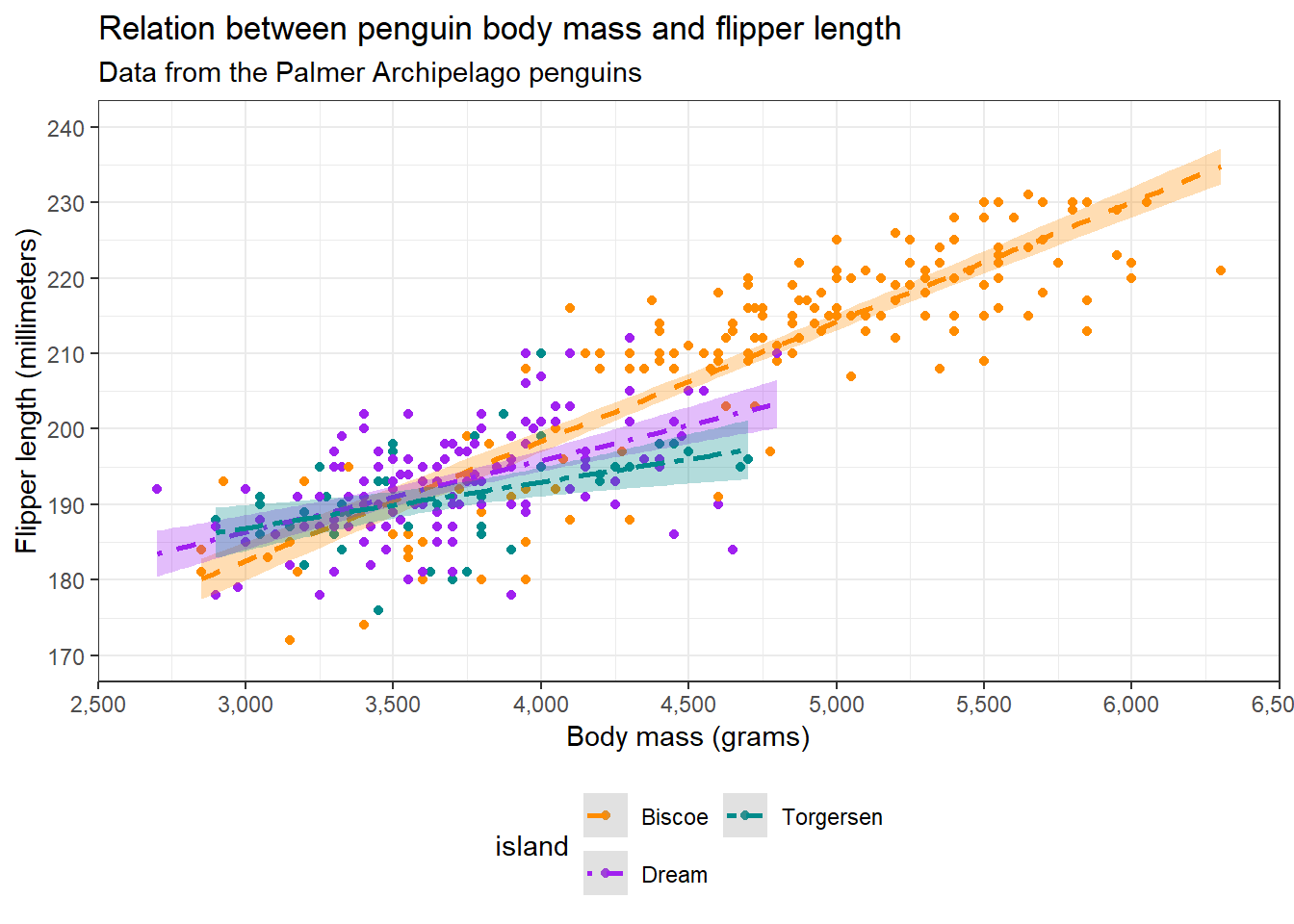
{ggplot2} offers us some themes with presets, but we can also specify a theme ourselves with theme(). The figure we have currently been making has a white background, but the website does not. Additionally, it would be nice to make the title bold and justify it to the middle. Let’s do that now:
ggplot(penguins, aes(x = body_mass_g, y = flipper_length_mm, colour = island, fill = island, linetype = island)) +
    # Geometries
    geom_point() +
    geom_smooth(method = "lm", formula = "y ~ x", , alpha = 0.3) +
    # Scaling
    scale_x_continuous(name = "Body mass (grams)",
                       limits = c(2500, 6500),
                       breaks = seq(2500, 6500, 500),
                       labels = prettyNum(seq(2500, 6500, 500), big.mark = ","),
                       expand = c(0, 0)) +
    scale_y_continuous(name = "Flipper length (millimeters)",
                       limits = c(170, 240),
                       breaks = seq(170, 240, 10)) +
    scale_colour_manual(values = c("darkorange", "purple", "cyan4"), aesthetics = c("colour", "fill")) +
    scale_linetype_manual(values = c(2, 4, 6))  +
    # Labels
    ggtitle("Relation between penguin body mass and flipper length", subtitle = "Data from the Palmer Archipelago penguins") +
    guides(fill = "none",
           colour = guide_legend(ncol = 2, position = "bottom")) +
    # Aesthetics
    theme(plot.background = element_rect(colour = "#002b36", fill = "#002b36"),
          plot.title = element_text(hjust = 0.5, face = "bold"))
Warning: Removed 2 rows containing non-finite outside the scale range
(`stat_smooth()`).Warning: Removed 2 rows containing missing values or values outside the scale range
(`geom_point()`).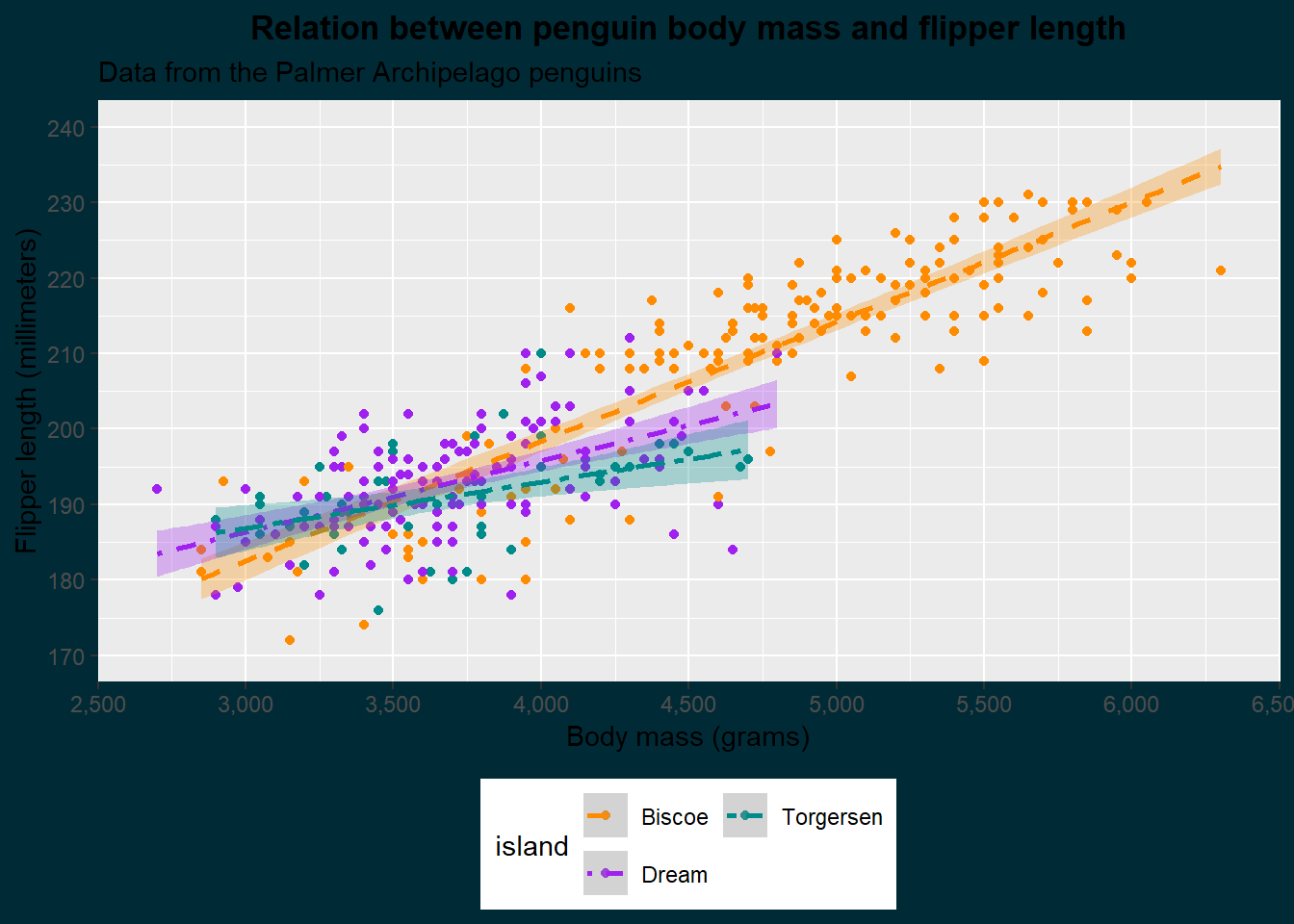
As you can see, we specify different elements of the plot and provide them with an element function. This is either element_blank() which simply turns that element off, or an element corresponding to that geometry (text for text, line for lines, and rect for rectangles). Besides the plot, which is the whole figure, we can also specify the panel in which the data is shown with panel elements. We set the plot background to match the colour of the website and the title to the horizontal center (hjust) and made it bold (face). Let’s make some more additions:
ggplot(penguins, aes(x = body_mass_g, y = flipper_length_mm, colour = island, fill = island, linetype = island)) +
    # Geometries
    geom_point() +
    geom_smooth(method = "lm", formula = "y ~ x", , alpha = 0.3) +
    # Scaling
    scale_x_continuous(name = "Body mass (grams)",
                       limits = c(2500, 6500),
                       breaks = seq(2500, 6500, 500),
                       labels = prettyNum(seq(2500, 6500, 500), big.mark = ","),
                       expand = c(0, 0)) +
    scale_y_continuous(name = "Flipper length (millimeters)",
                       limits = c(170, 240),
                       breaks = seq(170, 240, 10)) +
    scale_colour_manual(values = c("darkorange", "purple", "cyan4"), aesthetics = c("colour", "fill")) +
    scale_linetype_manual(values = c(2, 4, 6))  +
    # Labels
    ggtitle("Relation between penguin body mass and flipper length", subtitle = "Data from the Palmer Archipelago penguins") +
    guides(fill = "none",
           colour = guide_legend(position = "bottom")) +
    # Aesthetics
    theme(plot.background = element_rect(colour = "#002b36", fill = "#002b36"),
          plot.title = element_text(colour = "#FFFFFF", hjust = 0.5, face = "bold"),
          plot.subtitle = element_text(colour = "#FFFFFF", hjust = 0.5, face = "italic"),
          panel.grid = element_blank(),
          panel.background = element_blank(),
          axis.line = element_line(colour = "#FFFFFF"),
          axis.text = element_text(colour = "#FFFFFF"),
          axis.title = element_text(colour = "#FFFFFF"),
          axis.ticks = element_line(colour = "#FFFFFF"),
          legend.title = element_blank(),
          legend.background = element_blank(),
          legend.text = element_text(colour = "#FFFFFF"))
Warning: Removed 2 rows containing non-finite outside the scale range
(`stat_smooth()`).Warning: Removed 2 rows containing missing values or values outside the scale range
(`geom_point()`).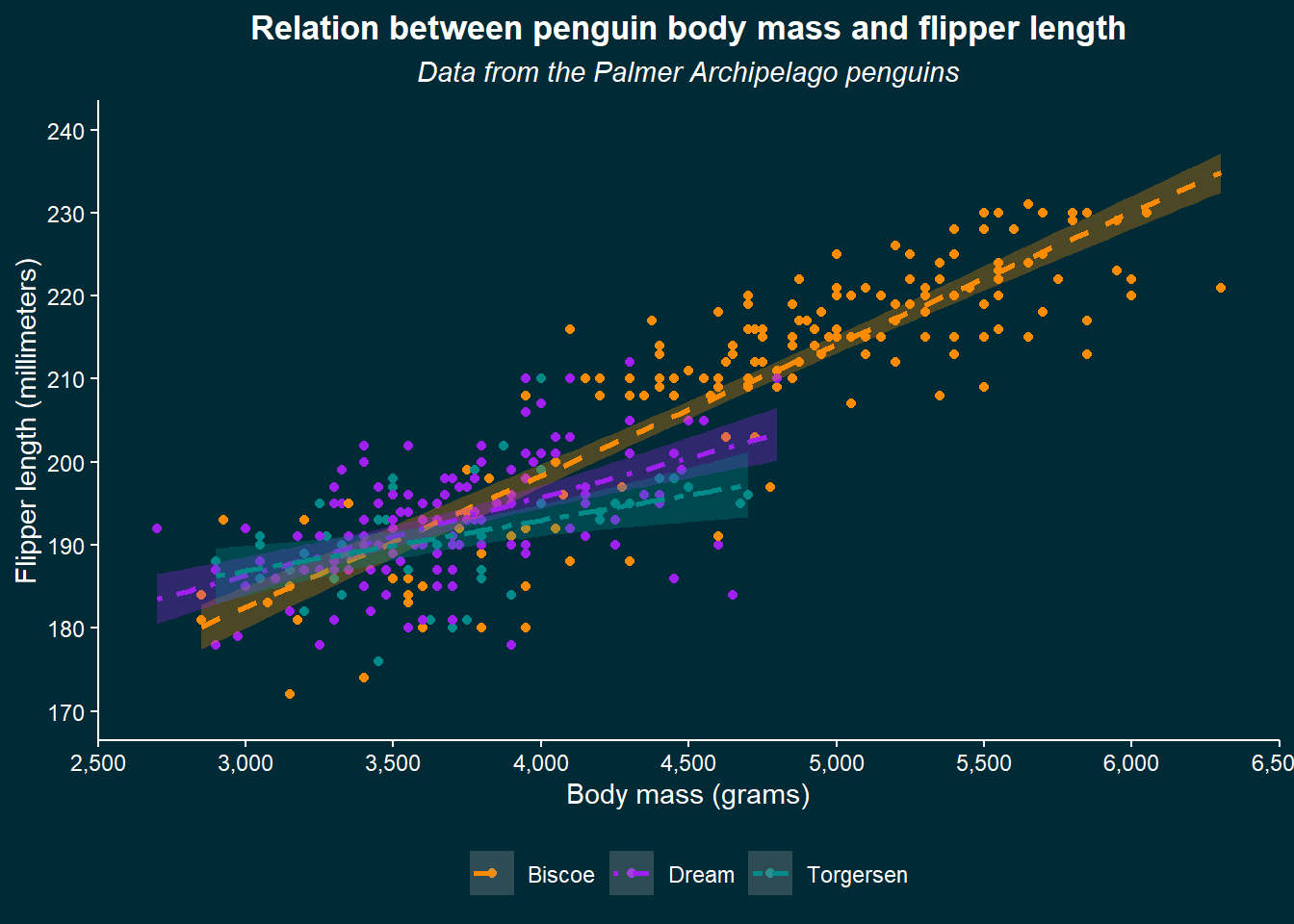
We now specified a whole lot more, from the axes details to the gridlines in the panel and more parts of the legend. We can be happy now with our plot, but know that you can modify almost anything imaginable. If you wonder whether it’s possible, just try to look it up and likely you’ll find some solution to do it.
We have walked through the whole build-up of a {ggplot2} figure and you are ready to make your own! If you are in doubt, you can always look at {ggplot2}s function reference.
For each plot we have created, we have been seeing two warnings be repeated:
1: Removed 2 rows containing non-finite outside the scale range (`stat_smooth()`).
2: Removed 2 rows containing missing values or values outside the scale range (`geom_point()`).
When you see these warnings, be aware of what they mean. As the warnings say, there are either missing values (NAs) in your data that cannot be plotted, or more importantly there are data points that fall outside of the limits of the axes you specified. These are subsequently cut-off, even though they might be important to show. Always make sure to know why these warnings occurr and annotate whether that is expected behaviour in your code.
{graphics}
A popular alternative to {ggplot2} is base R plotting which is accessible through the (by default installed) {graphics} package. Although this author is of the opinion that {ggplot2} offers superior flexibility and clarity in making figures, there is no harm in going through the basics.
We can first use the general function plot() to create a base scatter plot:
# Create x and y variables
x <- penguins[["body_mass_g"]]; y <- penguins[["flipper_length_mm"]]

# Initiate plot
plot(x = x, y = y,
     main = "Relation between penguin body mass and flipper length",
     sub = "Data from the Palmer Archipelago penguins",
     xlab = "Body mass (grams)",
     ylab = "Flipper length (millimeters)")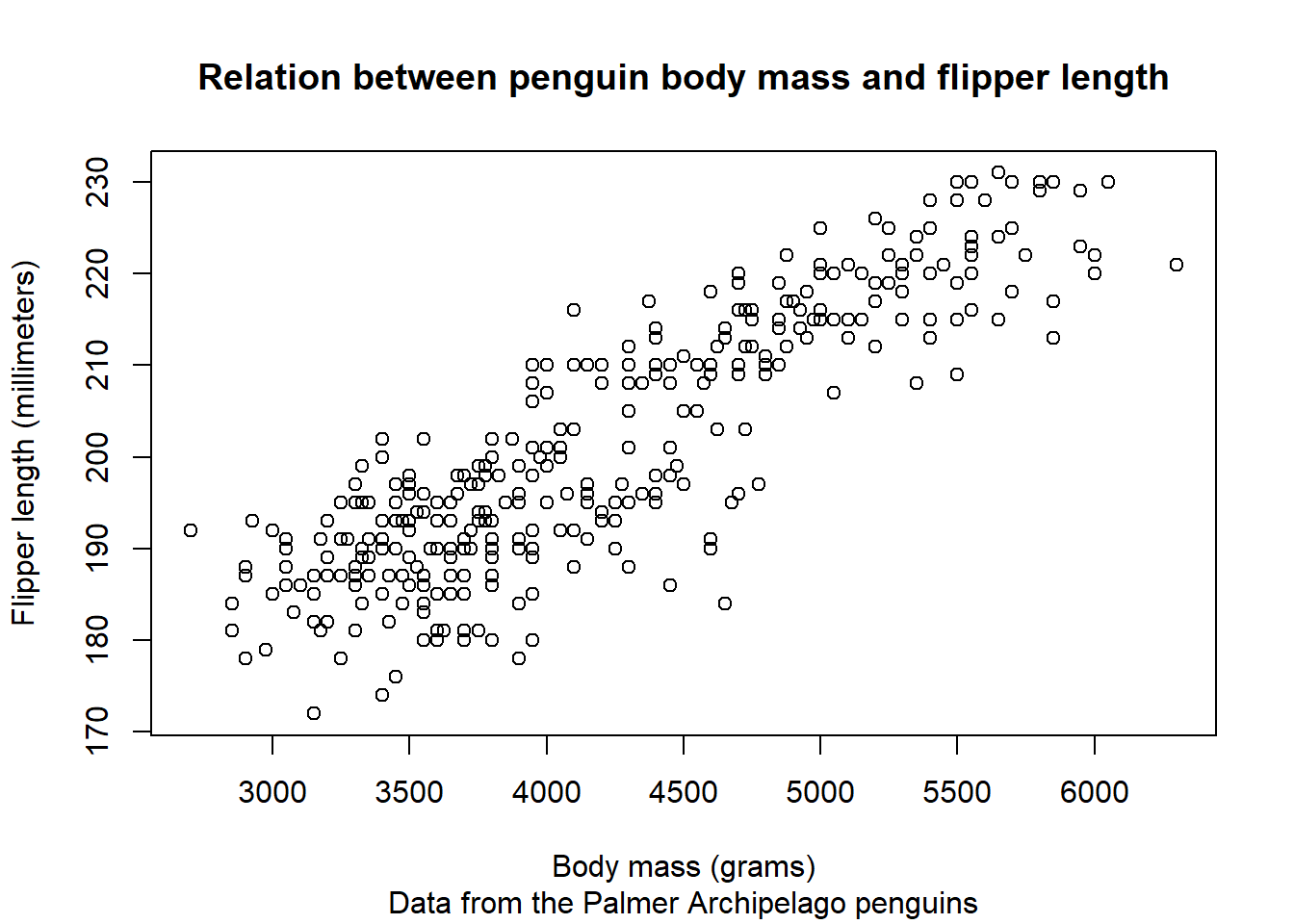
This plot is now initiated and we can add on layers by calling new functions (instead of using the + operator as in {ggplot2}):
# Create LOESS smoother to add to data
smoother <- loess(y ~ x)

plot(x = x, y = y,
     main = "Relation between penguin body mass and flipper length",
     sub = "Data from the Palmer Archipelago penguins",
     xlab = "Body mass (grams)",
     ylab = "Flipper length (millimeters)")

# Add line to initiated plot
lines(predict(smoother), col = "#B58900")
In all honesty, this author is not versed enough in base R plotting to recreate the figure made with {ggplot2}. Whereas {ggplot2} is more verbose to create simple plots, the infinite amount of customisation one can do and the structured way each plot is built up make it a favourite that foregoes any effort to gain in-depth knowledge of a different plotting system.
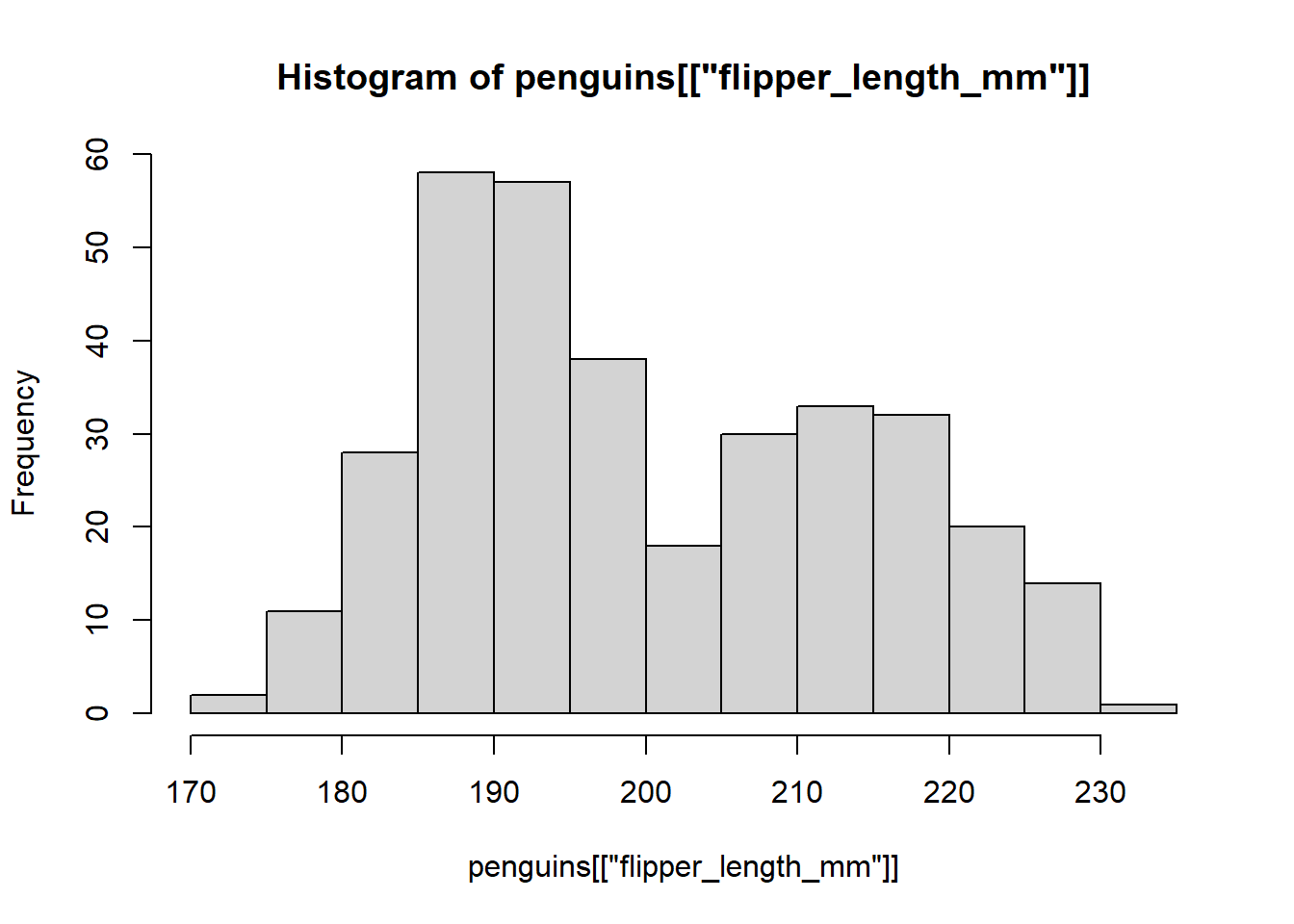
However, the base R plotting system is much easier to make simple plots and is well integrated with base R functions. For example, for a histogram, we can simply use the function hist():
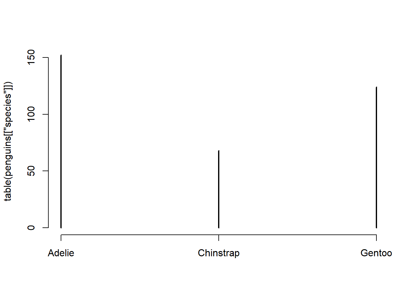
To create a barchart, we can simply use the table() function together with plot():
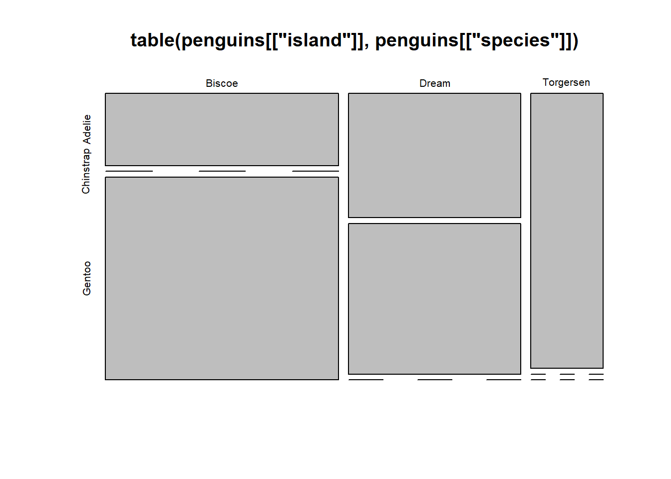
We can also stratify that by island:
This author is quite well-versed in {ggplot2} but not in {graphics}. No matter which method we want to use, often we might not know where to start. Luckily, a great source of help exists in the shape of the R graph gallery. This website contains an array of different charts and freely available example code of how to make these charts using both {ggplot2} and {grahpics}.
Patching plots together
{patchwork}
{graphics}
Interactive plots
Another method of creating plots in R is using the {plotly} package. Although this package is able to create plots on its own, it can also effectively be used to create interactive plots. This can simply be done by using the function plotly() for {plotly} plots or ggplotly() for {ggplot2} plots:
# Create ggplot2 plot
p <- ggplot(penguins, aes(x = body_mass_g, y = flipper_length_mm, colour = island, fill = island, linetype = island)) +
    # Geometries
    geom_point() +
    geom_smooth(method = "lm", formula = "y ~ x", , alpha = 0.3) +
    # Scaling
    scale_x_continuous(name = "Body mass (grams)",
                       limits = c(2500, 6500),
                       breaks = seq(2500, 6500, 500),
                       labels = prettyNum(seq(2500, 6500, 500), big.mark = ","),
                       expand = c(0, 0)) +
    scale_y_continuous(name = "Flipper length (millimeters)",
                       limits = c(170, 240),
                       breaks = seq(170, 240, 10)) +
    scale_colour_manual(values = c("darkorange", "purple", "cyan4"), aesthetics = c("colour", "fill")) +
    scale_linetype_manual(values = c(2, 4, 6))  +
    # Labels
    ggtitle("Relation between penguin body mass and flipper length", subtitle = "Data from the Palmer Archipelago penguins") +
    guides(fill = "none",
           colour = guide_legend(position = "bottom")) +
    # Aesthetics
    theme(plot.background = element_rect(colour = "#002b36", fill = "#002b36"),
          plot.title = element_text(colour = "#FFFFFF", hjust = 0.5, face = "bold"),
          plot.subtitle = element_text(colour = "#FFFFFF", hjust = 0.5, face = "italic"),
          panel.grid = element_blank(),
          panel.background = element_blank(),
          axis.line = element_line(colour = "#FFFFFF"),
          axis.text = element_text(colour = "#FFFFFF"),
          axis.title = element_text(colour = "#FFFFFF"),
          axis.ticks = element_line(colour = "#FFFFFF"),
          legend.title = element_blank(),
          legend.background = element_blank(),
          legend.text = element_text(colour = "#FFFFFF"))

# Make interactive
ggplotly(p)
Warning: Removed 2 rows containing non-finite outside the scale range
(`stat_smooth()`).